A Touch of Whimsy
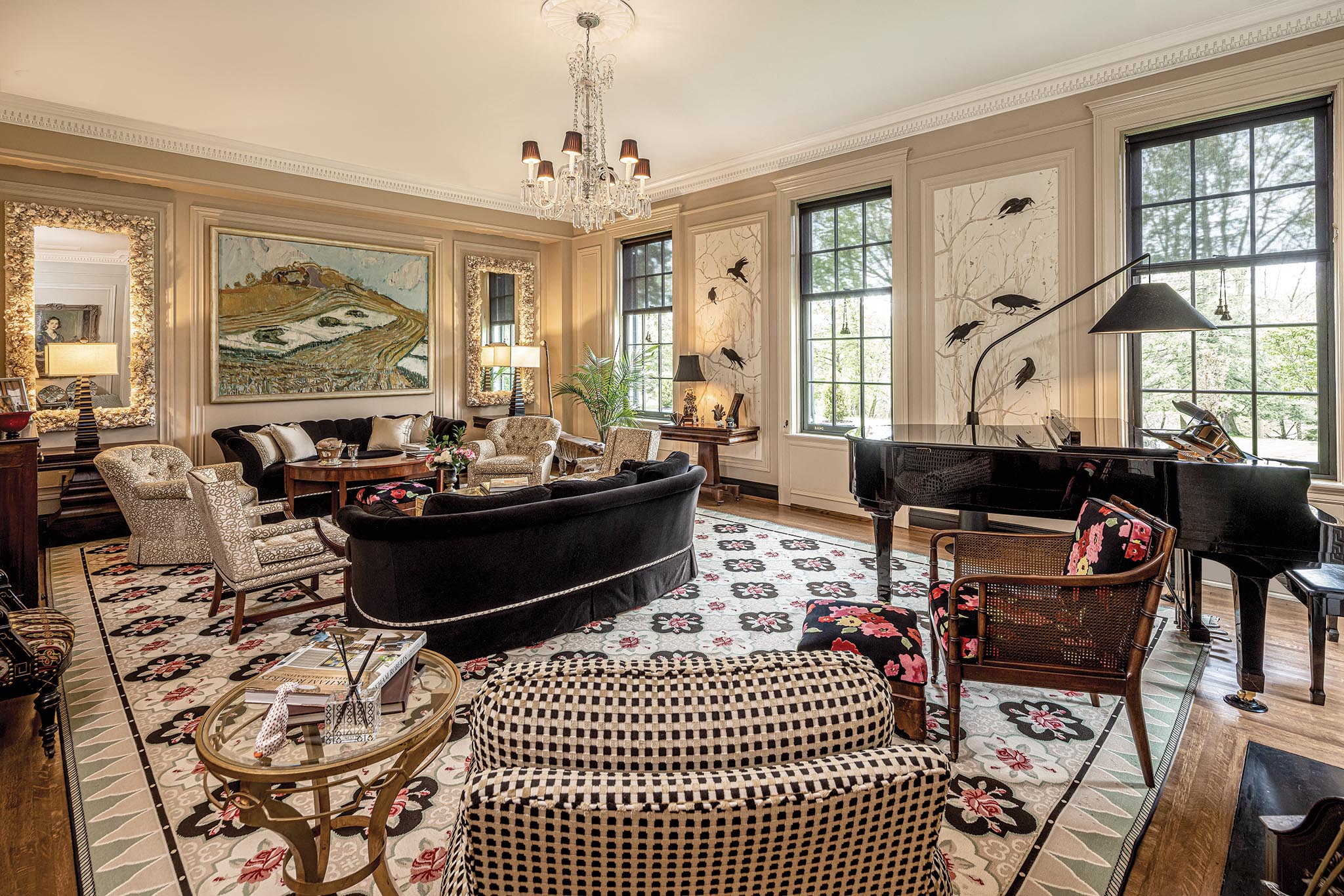
Walk into the living room of Suzanne and Peter Friday’s historic home and the first thing you notice are the crows. Big black crows, perched on branches nestled into wall panels placed between the large windows.
They inject a note of whimsy into the stately room, which is anchored by a large, cabbage rose-patterned Wilton rug. The crows were inspired by images in Jim Dine’s “Birds” book and painted by Melody Lockerman, but chosen by Suzanne, who has a thing for birds. “Especially crows,” she says. “I admire their intelligence. They’re just kind of badasses.”
But just as important was the dynamic the birds create in a room that is at once formal and relaxed. Suzanne, the former vice president of interior design at LD Astorino, started her own firm, Friday & Genter Interior Design, more than two decades ago. Saddled with an expensive rug she wanted to update, Suzanne modernized it by emphasizing the black in the pattern. Hence, black sofas join the crows and other accents in cutting the sweetness of the rug.
Surprises abound throughout the home the Fridays have lived in for 26 years. But most impressive is the way Suzanne has updated the interiors while retaining the important historic nature of the home.
The borough of Edgeworth was barely a decade old when the Crittenden family hired the architecture firm of Rutan & Russell to design their new residence. A successor to the Pittsburgh office of Boston-based H.H. Richardson, Rutan & Russell had designed the Schenley Hotel (now the William Pitt Union), the Diamond Market House and the B.F. Jones house on the North Side.
But Edgeworth and neighboring Sewickley were the hot spots for grand homes of the day, given their distance from the industrial wheels that turned Pittsburgh. Wealthy families moved to the countryside to escape pollution, and in 1915, when Sucasa, as the Crittendens named their home, was built, it commanded a swath of land high on a hill. With 12 bedrooms and a ballroom on a lower level, it could both host a big party and have guests spend the night.
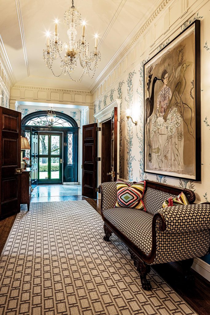
As the years progressed and the house passed to various owners, alterations were made to accommodate changing lifestyles. The most dramatic were made in the 1960s by Oliver Kaufmann, cousin to Edgar Kaufmann Jr., whose family built Fallingwater. Kaufmann lopped off the excessive bedrooms and a two-story Chippendale-inspired porch, reorienting the classic center hall entrance to the side.
When the Fridays first saw the home, they were smitten by the 11-feet ceilings and the intricate moldings. “I liked the grandeur of the house, and the privacy,” Suzanne says. They raised the roof above the kitchen wing to reinstate the old day and night nurseries, bringing the total of bedrooms to five. And a large family room was created next to the kitchen by combining a series of maid’s quarters.
“We made changes patiently and with purpose. When we moved in we had twins in elementary school and a baby and I’m glad that we paced ourselves. One’s eye develops. The house has been somewhat of a laboratory for me over the years. There are opportunities to regularly tweak the design and keep it fresh.”
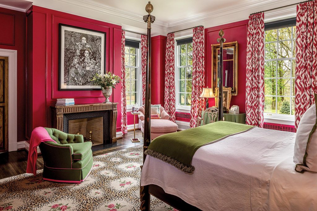
A recent renovation of the master suite is a case in point. It had been 20 years since Suzanne designed the room, and though she still loved it, she knew it was time for a change. “Bedrooms are important to me. It’s where you start the day and end it,” she says. Graced by a beautiful fireplace and three large windows, the room had good bones made better by a deep raspberry color trimmed in white.
“It is a surprising color choice,” Suzanne acknowledges. “I feel very strongly that the bedroom should cater to the woman, but Peter did pick that color. I had a shade lighter and he liked the dark color. The starting point was Stark’s leopard rose area rug. There are a few different directions one can go. I opted for drama in the room. I like the way the dark raspberry cloaks the room. It’s a sexy room at night, and the big windows bring in so much green during the day.”
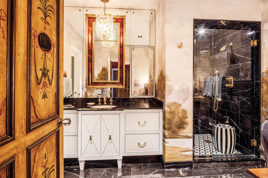
The bathroom, which Suzanne says was the ugliest room in the home, is newly clad in Nero Saint Gabriel marble in keeping with the other marble bathrooms but enlivened by a photo mural from Area Environments. A contemporary wall-mounted toilet and matte brass fixtures from Phylrich contrast with an antique vanity and mirror, creating a yin and yang effect Suzanne was seeking. Designing for herself, she says, is very different.
“I take risks in this house that I won’t necessarily take with a client. I think the design needs to be contextual with the architecture of the house, so there are parameters for making selections. Cost is a factor too. These rooms are large, so everything is more expensive because of the scale. You need big art, large scale fabrics, big rugs. It adds up. This is a historically significant house and we’re lucky to live here, but it demands a certain level of quality.”
Fortunately the Fridays arrived well equipped with the antiques that are on abundant display. Suzanne has been buying antiques since she was 12 with the assistance of her mother and business partner, Anne Genter, who at one point owned Strawberry Hill Antiques in the early ’70s.
“There’s a curated approach to decorating a house. I had an advantage in that I came to this house with things. I didn’t have to fill this house in one or two years. There are different sources for things and old things are reupholstered. That’s hard for me as a designer now, with new construction and no pieces to start with. I try to avoid going to one source, even though that might be easier, but to get the depth and layers that make an interior interesting, you have to diversify.”
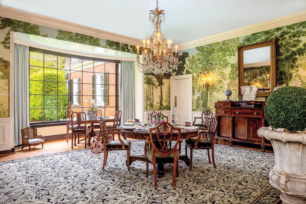
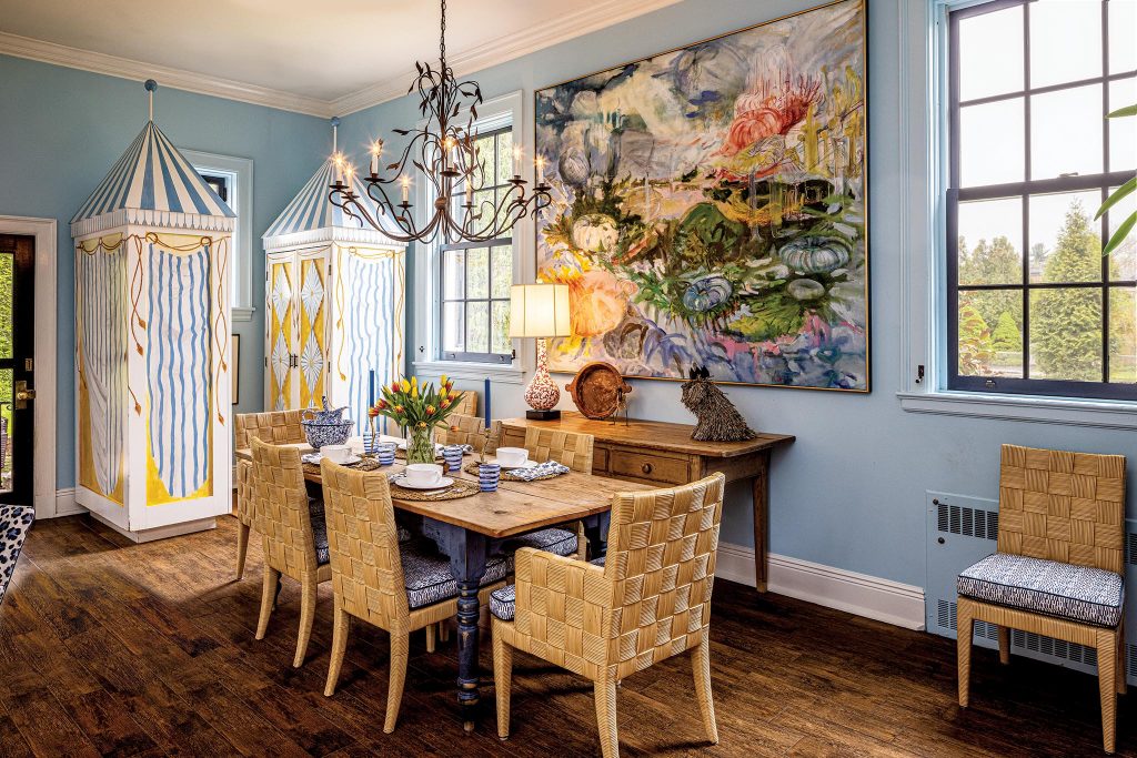
To get personality, you have to do more than that. Enter the touches of whimsy that permeate the house. A formal dining room the couple uses every night for dinner has walls covered by an Iksel photomural called “Italian Panorama.” A swan’s head juts from a guest bedroom wall, a sheep sculpture stands guard in the hall, beach cabanas serve as storage in the family room and birds are everywhere, including the crow doorbell. Which brings us back to the living room and those crows on the wall.
“I have a few bird-phobic clients and it’s painful for them to be in here,” says Suzanne with a laugh. “But the panels are removable. If someone doesn’t like birds they are coming with me!”

