When most people become empty-nesters, they think about downsizing, buying a vacation home, perhaps, or seeing the world with their newfound freedom. But one Fox Chapel couple decided to pursue a different dream — staying home and making the renovations to their 1965 Colonial that years spent traveling with two children active in sports had precluded.
“A house project to the extent we wanted wasn’t feasible at the time. I don’t think we could have lived through this project with kids still at home!” says the wife. “We love our street and our neighbors and know this is where we are staying put in Pittsburgh. With the kids grown and flown, the time was right and we knew making the investment would certainly be worth it. What started as a desire for a big mudroom for dogs and a master suite evolved into a much bigger project. It turned out to be a whole-house renovation.”
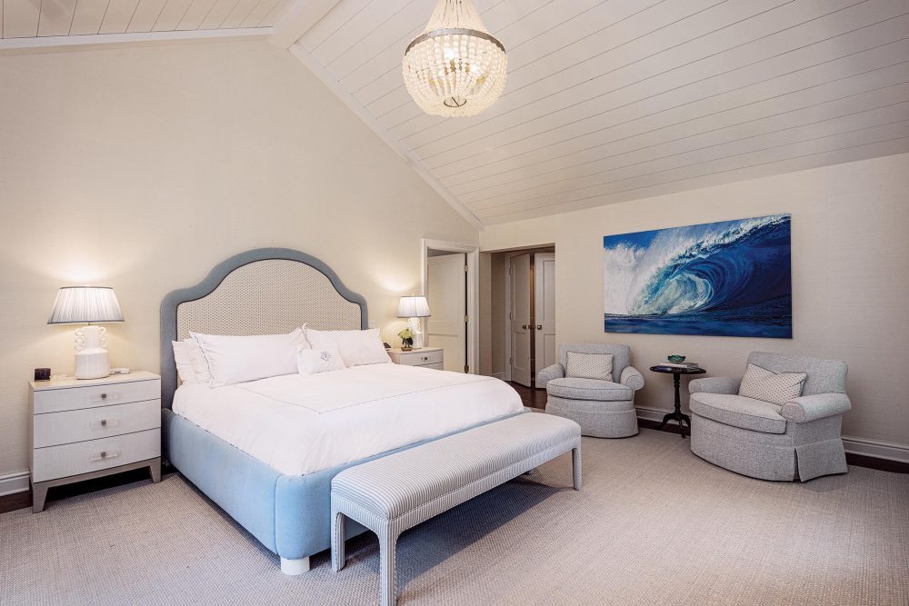
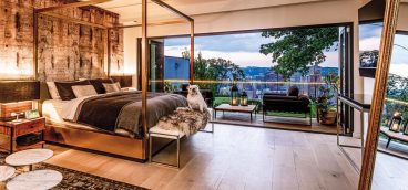
A lighting fixture from Mecox hangs in the vaulted ceiling of the master suite, which spans the second floor. Thibaut grasscloth covers the walls, Schumacher fabric is used in the custom swivel chairs and the bed was made by Blawnox Upholstery. The painting “Wave” is by Jason Bereswell.
So much bigger, in fact, that the couple moved out for 1 ½ years while an addition was built and walls were re-configured to create a home for the next phase of their lives. Enter Ramsey Lyons of Ramsey Lyons Design, who had worked with contractor Jim Marshall on other projects. “I love her style. She has amazing taste in every aspect,” says the wife, who happily began the process of thinking how they wanted to live in the new spaces that were being created.
“Ramsey mixes fun with sophistication and totally understood what we wanted. She has a ton of energy and is super hands-on with everything she does. Ramsey wanted to stay true to the style of our home, but also at times challenged us to think a little more outside the box. We trusted her implicitly with every aspect of our project.”
The dogs — a Great Dane and Lab — were a big factor when Lyons arrived on the scene. The owners wanted a mudroom where they could bathe them. Lyons gave them much more — closets, heated floors, and a retractable Chippendale-style gate that disappears next to a new desk area. She also significantly modified the original floor plan of the addition, as well as the adjoining rooms, removing the dining room walls to create a larger, open kitchen and pantry.
“We started from the very beginning, so we picked the casework, windows, every piece of flooring, baseboards, grilles for HVAC, the ceilings, the lighting plan,” says Lyons, who had a career in finance in New York before starting her design firm six years ago.
Driving many of the decisions was the desire to bring as much natural light into the spaces as possible, and to design a kitchen and family room that would serve as the central gathering space.
“We had to reallocate the dining room to have great seating in the kitchen. We lost the formal dining room, but we agreed that was the only way to get the function and flow they wanted.”
Several other walls sectioned off the kitchen, so Lyons suggested removing them and an exterior door so the couple could have a generous bar. They balked initially, but now it’s one of the family’s favorite places.
“They were great, and trusted the process. Some people want to hand pick every piece. They said, ‘We like what you do; show us what you have.’ They made it really fun for me to work on,” says Lyons.
She credits Larry Flock of The Kitchen Gallery for the exceptional kitchen. “He does a great job, very creative, not cookie cutter. It looks incredibly custom, which it is. They are a very easy partner.”
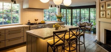
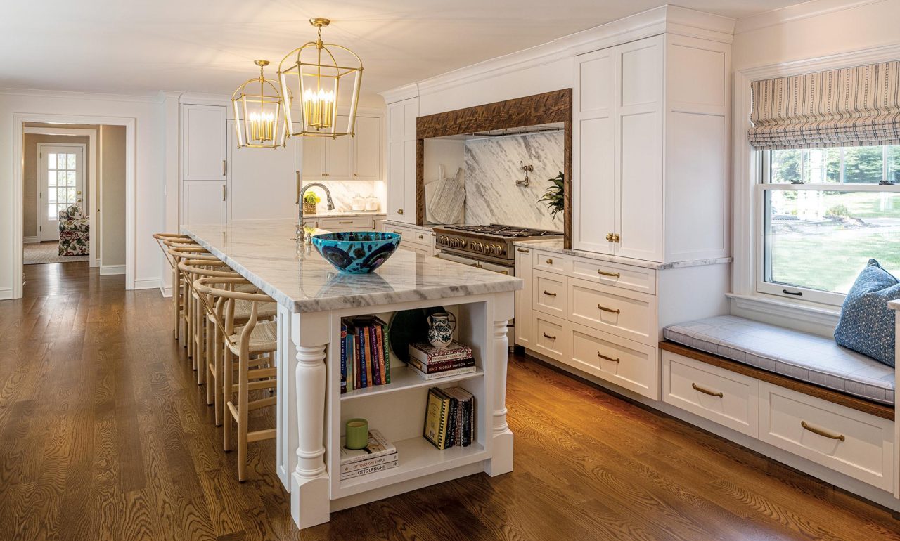
Because the wife is an accomplished cook, an eight-burner open-flame Blue Star range centers the kitchen, along with an island topped by an impressive single 12 ½-foot slab of marble. A new, large window across from the island has a banquette in front of it and looks out onto the patio and garden.
“They wanted to seat five or six people at the island, and they can have people at the dining table. We had the flexibility of having the china pantry and bar as additional storage. And we wanted the range to feel like a visual focal point.”
Another focal point is just around the corner. The open pantry features a vibrant Schumacher wallpaper that makes it seem like a tiny jewel box. Using color and prints so they work as a neutral is one of Lyons’ trademarks.
“I came into this industry at a time when a lot of people were doing fabric lines and being creative with textiles and that made it easy for me. You have to match the house and personality. It has to make sense. We knocked down the traditional, but kept it a bit. They wanted fun wallpaper in these small spaces to have them come alive.”
The master suite upstairs now boasts an expansive bath with a great shower, separate vanities, a built-in hamper and linen closet and his-and-her dressing rooms. Handmade tile covers the shower walls, the floors are marble, and millwork that matches the rest of the house was used around the mirrors. Just down the hall is the laundry center, all contained in the addition so it functions as private quarters away from the original part of the house.
“I want to decorate so that people use all the rooms in their house,” says Lyons. “I want people to be excited about the space we’re doing and be comfortable in it. If you spill red wine, it’s fixable. I like to do layers in a casual, fun way. My goal is for people to walk into their homes and feel relaxed, to love the space around them and for it to feel like them, not me. Not everyone wants the way I would decorate for myself — 10 different prints in one room,” Lyons says with a laugh.
“To say we are happy is an understatement,” says the wife. “We have waited 20 years to do this project. To be able to bring muddy dogs into the dog wash, to have a big group of family and friends in the wide-open kitchen, and to have a master suite we have always dreamed of . . . we feel very blessed. Our adult children love what we have done as well, as it still feels like home to them. I will say we definitely were thinking about future grandchildren with some of the design decisions!”

