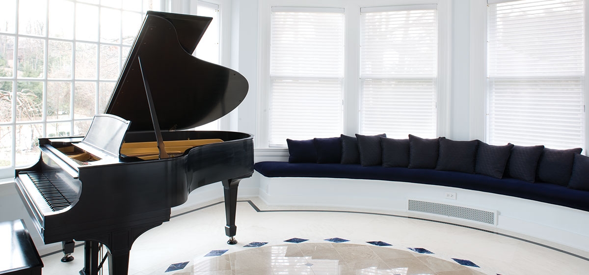
A casual inventory of the materials Philip Elias used for the interior of his 1920 home sounds like an exhibit in the hall of minerals. Semi-precious stones including tiger’s eye, lapis, charoite and sodalite mingle with Paridisio, Empress Green and Rojo marble as accents amid pale squares of Portugese limestone.
[ngg src=”galleries” ids=”29″ display=”basic_thumbnail” thumbnail_crop=”0″]
Such visual imagination comes naturally to Elias, a partner in the advertising firm of Elias Savion and CEO of Velocity, the country’s largest private broadcasting network. His background in both business and design has blended in many creative ways professionally, but the CarnegieMellon graduate found the ultimate outlet in his private life when he and his wife, Amy, decided to buy the old Frew mansion in Squirrel Hill.
The home that now glitters like a jewel once stood hidden behind a screen of overgrown vegetation and trees. Being able to see beyond that screen and the effects of age inside was the first step Elias took in his quest to craft a family home with all the pleasures of a hotel. Indeed, the 1,100square-foot center hall could pass for a hotel lobby, which is exactly the effect Elias wanted to create.
“I like commercial more than residential,” he says simply. “The relationship you have with a hotel when you’re traveling — there’s a level of anticipation and excitement. If it’s done well, it delivers a feeling of elegance.”
What Elias likes most and wanted to re-create in his home was the sense of calm and serenity without the distractions of clutter. The lines and scale of the home were exquisite, and light poured from abundant windows. With such raw material, Elias decided to emphasize the finishes rather than the furnishings. Combining his passion with a highly meticulous nature, Elias handled the design work with an assist from the late Charles Franklin, who was brought in to manage the project. He also worked closely with a series of master craftsmen to select materials, patterns and designs for every stage of the renovation.
The interior had been modernized in the ’70s with dropped ceilings and brickedup windows. The extensive woodwork in the center hall had been painted, and it took George Starz 220 man days to strip and stain it. Master marble cutter Paul Smith spent three years on the stone work. Nearly every window was not only replaced, but replicated with either custom or old glass, including stained glass by Rudy Brothers. The entire infrastructure was overhauled, with five furnaces and a 30-ton air conditioning system. The family also decided to create a 3,000-foot addition to house guest quarters, a pool kitchen and a four-car garage.
“You really need to take a look at the architecture of the house. If you’re not true to it, you ruin the architectural integrity,” Elias says. “When we put on that addition we found brick in Nebraska that matched the original. It cost more to get it here than the brick cost. We matched the cove ceilings, all that. When you walk through here you can’t tell the difference between the 1920 construction and today.”
Elias describes the kitchen as “controversial,” which means he got a lot of flak initially for covering every surface, including the walls, with absolute black granite.
“Amy is a great cook and had a lot of impact on the functionality of the space. Those soaring kitchens look great, but the last thing you want to do is walk 30 feet when you’re cooking a meal. The prep kitchen is set up like a cockpit, with four ovens, a large island and big cook top in the middle. If you’re standing on granite it’s a lot different than standing on wood, but granite is pretty bulletproof. Amy thought it looked hip, and everyone who walks in loves it.”
Large family gatherings are efficiently handled from the former kitchen, now the service kitchen, which features more ovens and dishwashers (there are six in the home) and storage for glassware, china and other dining necessities.
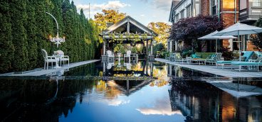
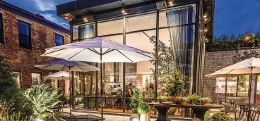
In summer the family lives outdoors by the pool, though the grill in the pool kitchen is used year round.
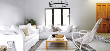
Despite the home’s size, the rooms flow together with ease. Bare floors, white or pale painted walls and minimal window treatments add a light, simple touch to the classic revival architecture.
“You need to have continuity in design. You need to think at a high altitude. That’s basically my concept of design. We wanted each room to have distinction, but not overwhelming uniqueness. That’s why that Portugese limestone was selected to be the palette for the first floor. It has an elegance but also a softness that is neutral.”
Adding punch is the art, with many colorful abstract paintings by Amy’s brother, James Lecce. Much of the furniture and cabinetry was custom-made, with specialty glass designs from Emerald Art Glass. The new mixes with a carefully edited selection of the old, including extraordinary Art Deco chandeliers, sconces that were original to the house and a 1917 Steinway grand piano.
“Commercial design is usually dealing with larger spaces, a different intent. I wouldn’t call our house cozy. It has that austere, esprit moderne feeling, a cleanliness, a classic modern feeling. It’s not over the top or fussy, but on the other hand it’s not warm. But I like that openness. You have visual focus on certain elements, not on a zillion things.”


