In a neighborhood known for its quiet streets, this one is especially peaceful, just a few leafy blocks of lovely homes with landscaped lawns and mature trees. That it’s just minutes from Sewickley’s village center was one reason the owners chose to live there. They had originally moved to a gracious old home in Sewickley Heights after living in Cleveland for 15 years. But with their children grown and gone, their needs changed.
[ngg src=”galleries” ids=”151″ display=”basic_thumbnail” thumbnail_crop=”0″]
“It was too much for just the two of us, more than we needed,” says the wife. “We had always been intrigued by village life and I had driven around looking at different houses thinking, if we were ever going to live in the village, where would we live?”
Call it serendipity, or fate, or plain good luck. When she learned that a friend who lived on one of her favorite streets—a hidden gem—was planning to sell, she mentioned that they were interested.
“My friend invited me for coffee and a look around on a beautiful winter morning when the sun was pouring in the windows. We sat in the sun room and she told me the history of their 20-plus years in the home. As an interior designer, I appreciate symmetry, natural light and classic lines. I immediately knew this was the house. Three months later we were under contract.”
That was in 2015, and the current owners are only the fourth family to live in the house since it was built in 1938 by W. Cordes Snyder. The fact that it remained largely intact was part of its appeal.
“We have all of the original house plans and virtually nothing but the kitchen and sunroom were changed. To some people that would sound like a nightmare,” laughs the wife. “But this house was so well built and thoughtfully designed that instead it was a preserved treasure.”
Drawing on her background in design, she saw great possibility for creating a home that was both aesthetically pleasing and perfectly scaled for her family’s needs.
“Our first thoughts were to change only the decorating style to reflect our own, and all of our furniture from our previous home fit right in. We refinished floors, painted walls, restored the wood in the den and added updates like Sonos. Because the walls are so thick, we need three different routers. Adding recessed lighting was a real challenge!”
Initially the couple didn’t think they would change the kitchen, which had been renovated by the previous owners. While it was attractive, it didn’t function for the way the new owners liked to live and cook. Just before the September closing they made the decision to gut it—with a mandate to be in the house by Christmas. Ted Stevenson, a local cabinet maker, was hired to outfit the kitchen and build the banquette in the breakfast nook, a space that had previously been an office. To save time, the couple opted for pre-finished cabinet doors in a color almost identical to the Farrow & Ball shade the wife had in mind for the kitchen she designed.
The high cost of replacing the kitchen windows with black metal ones that matched the existing back entrance enclosure led the couple to rethink their plan. They decided to match the pane size using wood windows instead. “On the kitchen side we painted the mullions charcoal to match the steel, but from the exterior they are painted white, which matches the rest of the façade, so in the end it was not just more cost effective but also the better design decision,” the wife says.
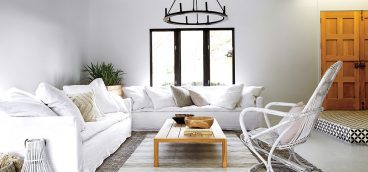
“I love to mix modern and traditional, and I think it’s most successful when you have a great architectural shell to do it in. What you do inside can be simply detailed and less decorated, allowing the architecture to do the work. I love curating things old and new. Some things in our home were our grandparents’ or parents’, and some are things my husband and I purchased on our trips, at local shops or even from a garage sale down the street, but every piece tells a story.”
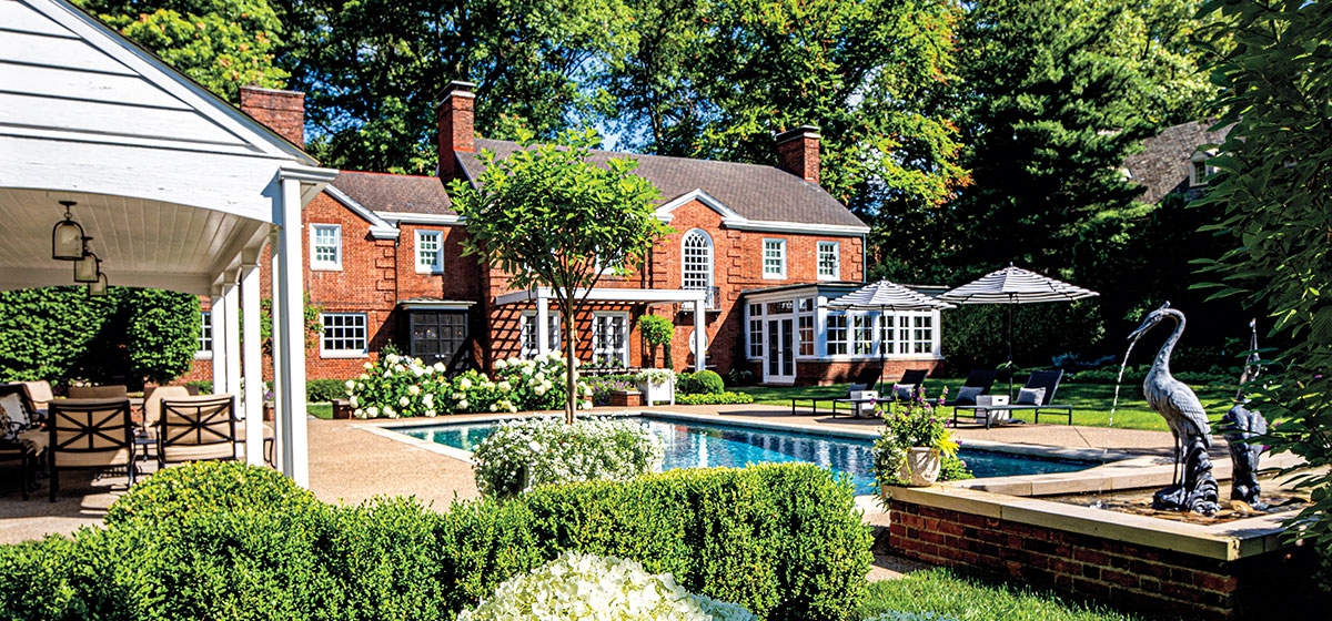
The same philosophy was employed for the outside spaces, where an existing pool and pool house were showing their age. Kendall O’Brien Landscape Architects was brought in to tackle the project.
“Patty Kendall is a friend and neighbor who has done many beautiful designs, including the front of the house under the previous owners. We hired Patty’s firm to come up with a concept for the backyard, and simultaneously asked an architect to determine if the pool house could be salvaged. The architect wanted to start over and better align the pool and pool house with the main house, but Patty had a vision to create outdoor ‘rooms’ for swimming, dining, garden and lawn on different axis points, which eliminated the need for the pool to be perfectly aligned.”
Kendall suggested creating two levels, a lower private space for dining by the kitchen door, stepping up from there to the pool area. New stone and brick walls and walkways were built around the pool and to define garden areas, dividing the backyard into hedge-lined exterior rooms.
“Patty sees exterior space in a great way! Being someone who likes order and simplicity, I immediately bought into her vision. I love landscape designer Edmund Hollander’s work, and Patty and I poured through his new book and identified design details that we wanted to incorporate into our landscape.”
The pool house from the 1960s was originally split into two dressing rooms, but the wife redesigned the space into four sections—a bath and dressing room, an outside drinks station, a garden shed and pool storage. Barn doors were added to cover the bar when not in use. The entire project took five months and included resurfacing the pool, new pool equipment, water lines, lighting, grading and planting. A fireplace was also added for cooler nights.
All the effort has been amply rewarded. “We love the scale of this house,” the wife says. “It’s well scaled for two people but big enough to put a table in the front hall and have 20 people for a sit-down Christmas Eve dinner. And all the living spaces have a southern exposure, so there is tremendous natural light, which makes every day better!”
Next up is a master suite renovation, but that’s another story.


