Modern Family

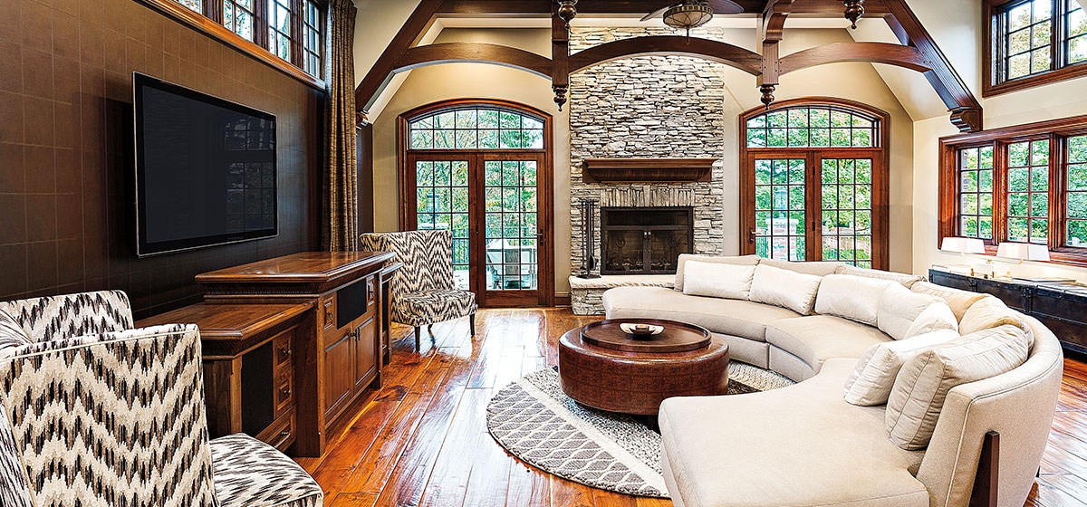
A traditional English Tudor in Mt. Lebanon may not seem to be the perfect choice for a young family with progressive taste. The classic bones and signature Tudor elements, such as the use of wrought iron and stone, might have deterred less courageous buyers.
[ngg src=”galleries” ids=”142″ display=”basic_thumbnail” thumbnail_crop=”0″]
But the 1931 residence had many of the qualities the couple sought. They were looking for a home that would accommodate a growing family—a second child was on the way—and that would support an entertaining lifestyle.
“They were buying a traditional home, but they weren’t traditional people,” says interior designer Lauren Levant, whom the couple brought to help realize their vision. “They were young, vibrant, with eclectic taste and a true appreciation for art and design.
“My task was to blend some of these elements together in a way that flowed. It was important to have a sense of continuity of concept between the various spaces in the home. To do this right, we designed the whole house at once. This was important to the clients, to feel like all the rooms were being considered in a cohesive way. We wanted different experiences in each area, but we wanted them to feel they spoke to each other.”
Though Levant has been based in Pittsburgh only four years, she has been designing interiors in Connecticut, New York and Washington, D.C., for 14 years. Her work has been featured in Elle Décor and Architectural Digest, and she has won more than 20 design awards in the past five years, including the National Kitchen and Bath Association’s Best Builder/Remodeler of 2018. She was named by Viking Appliance as their Designer of the Year in 2015, and was selected as one of HGTV’s top 10 American Designers under 35.
“We saw photographs of her work that she did in the D.C. area,” says the owner. “We wanted to use a designer who was not necessarily from Pittsburgh. When we contacted her we learned that she had actually moved here,” she adds with a laugh.
Levant has built a reputation for distinctive designs across a wide range of styles, with an emphasis on a clean, modern aesthetic. Extending that dynamic throughout the home gave her the opportunity to create something both highly stylized and personal for the family during the nine-month renovation.
“These clients were very involved in the process, they cared deeply about all of the decisions being made, wanting them to be completely right for their family. They were also very supportive of their art and design team, asking for our most creative ideas,” Levant says.
Of paramount importance to the health-conscious clients was the use of materials that were non-toxic, organic, natural, healthy and green.Great attention was paid to the composition of mattresses and fabrics, particularly in the children’s rooms. The floors were redone with non-toxic finishes; non-toxic paints were used and natural wool carpeting was installed. Materials that could easily be cleaned or replaced ensured that nothing was too precious to enjoy.
Levant employed an old-meets-new concept throughout the home, utilizing the best of both. While most of the rooms were unaltered structurally, the master bath did entail a gut renovation.
“It was very challenging in terms of layout. We combined two very small bathrooms into one long space to give the clients a feeling of openness, which we reinforced with the open shower. This required the bathroom floor to be installed at a slight pitch to allow the water to drain seamlessly. The walls of the bathroom are clad in shimmering white porcelain tile to reflect the light. The old-meets- new concept is expressed here with modern, high-gloss lacquer furniture sitting on a traditional stamped concrete floor tile. Vintage fixtures are combined with very modern fixtures for contrast.”
Many of the architectural details remained unchanged, including the iron banister and travertine floors in the entrance hall. Levant used a high-contrast black and white color scheme to give the space a modern energy. It also kept the design clean and kept pops of color, like the arched redwood front door, from being overwhelming.
“The ebony walls, the graphic pattern of the carpeting in the foyer and the statement light fixture all help bring a sense of drama to a traditional space and give it a modern feel,” Levant notes. “Off the foyer we also have the deep red crocodile accent wall. The monochromatic drama of the foyer prepares us for a punch of color in the living room.”
Most of the furnishings were newly purchased for the home, and custom-designed pieces in metal or wood and glasswork were created by local artists, who were commissioned by Levant to make unique pieces. Levant also helped to choose the art, introducing the clients to Michael Lotenero, who is based in Pittsburgh and Brooklyn, and from whom they selected three large-scale paintings.
“Working with clients like these is a rare gift as a designer because they have a remarkable level of understanding in regards to design,” says Levant. “They were adventurous and collaborative and also truly appreciative of the hard work it takes to bring about unique projects. This home now has an eclectic sophistication that reflects the best of both modern and traditional design.”
The admiration is mutual. “It’s awesome,” says the owner of the finished project. “We feel so comfortable in it; it doesn’t feel overdone. We designed some of the pieces with Lauren, like our kitchen table. A lot of our ideas turned out to be exactly what we wanted.”


