Modern English

From the outside, the stone and shingle cottage could easily be perched along a bucolic lane in the Cotswolds instead of a quiet road in Fox Chapel. That’s what makes the inside all the more remarkable.
[ngg src=”galleries” ids=”9″ display=”basic_thumbnail” thumbnail_crop=”0″]
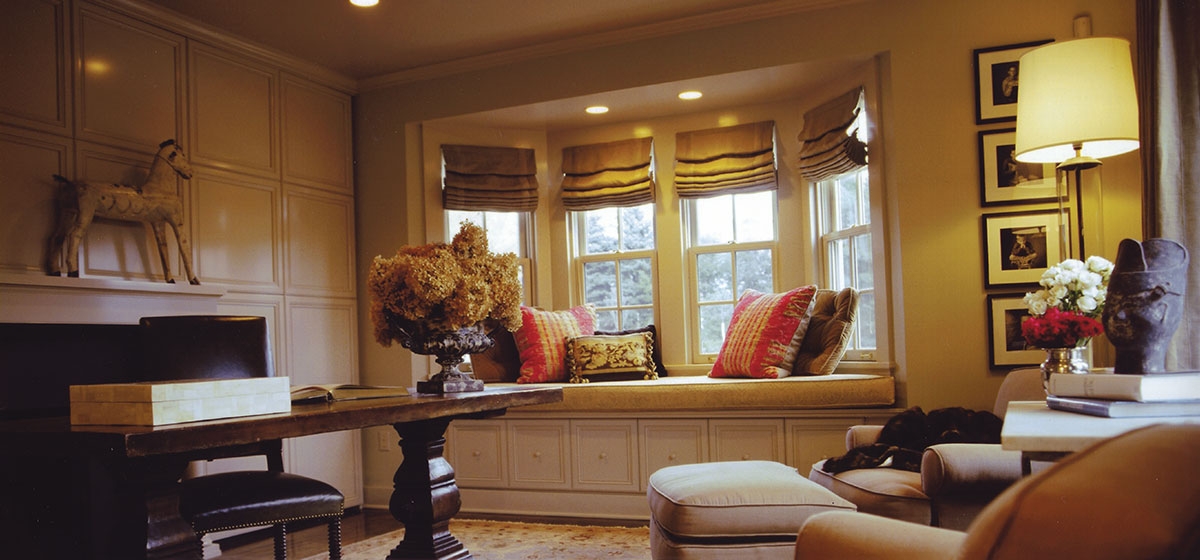
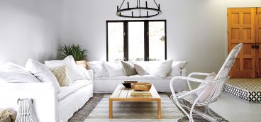
Eschewing the more traditional approach suggested by such architecture, designer Kathleen Clements devised a sophisticated interior that purifies modern English country. Paring it down to the most basic elements, she retained the charm but rejected the clutter so often associated with the style. Her approach is minimal yet warm, and the result is quietly revolutionary.
Clements’ marching orders from the owners, John and Diane Fisher, were simple. “It had to feel elegant and calm without being fussy,” says Diane. “And with four boys, nothing was going to be precious.” Clements felt the cottage-like exterior should be reflected in the design, especially in terms of comfort. “Diane didn’t want any room that felt like no one could go in there, no piece of furniture that someone couldn’t sit on. Nothing prissy.”
From the large Ralph Lauren sofas and vintage wing chairs in the family room to the glossy leather Dessin-Fournier sofa and Rose Tarlow chairs in the living room, the furniture is slightly over-sized in a way that invites use. An abundance of antiques fills the room, testimony to numerous shopping trips to New York, Paris, Chicago, Atlanta, Houston and, locally, Weisshouse, where designer Anthony Lamb was an integral part of the project. The two women scoured their sources, from flea markets to the best showrooms, and became fast friends in the process. Both are lively, funny and down-to-earth, and that lack of pretense is apparent in every piece they chose.
Standouts include a massive pine bookcase in the living room that meant so much to the dealer, he personally delivered it from Chicago. A long, 19th-century English oak dining room table was discovered by Diane. “She said when the boys are married and bringing their wives home, I want a table where they can all sit,” laughs Clements. The chairs were found in Houston, but there weren’t enough. Clements had them copied by a furniture maker in New Orleans, who sent pieces of them to England. “It’s very difficult to tell them apart.”
Accessories were kept to a minimum. Diane’s collection of bird nests occupies the front entrance shelves, and she and John chose the eclectic assortment of paintings, from old landscapes to modern pieces including a Louise Bourgeois in the hall. An exquisite 18th-century Spanish Madonna and child rests on an 18th-century Swedish commode backed by Fortuny curtains in the dining room, and a Christopher Spitzmiller lamp in a deep oxblood is perched next to an old goose decoy in the living room. Throughout the home, lanterns and simple black sconces from Holly Hunt provide subdued lighting.
“Diane was the ideal client. She was completely open to learning,” says Clements. And John was the ideal husband, Diane jokes. “He put the money in the account and stepped aside!” That freedom combined with Diane’s adventurous spirit made much of what is unique in the house happen. “Kathleen really pushed me to not conform, to go all the way. We basically ripped the whole house apart.”
Clements began her career in New Orleans, where her work and her design shop, Sister Agnes, garnered attention in national magazines. Her husband is a football coach, which meant moving with him to Pittsburgh when he joined the Steelers, and after that to Buffalo and Green Bay. To keep things sane, she maintains an office in Los Angeles, where her clients include the owner of BCBG. She continues to work in Pittsburgh, where other clients include Rob and Christina Cochran and Glen and Diane Meakem.
Such a vagabond existence keeps Clements attuned to every trend she encounters, which she distills into her distinctive approach. That’s most true with the backgrounds that set the stage for the house to shine. She proposed installing wide-plank maple floors, staining them a dark walnut and sealing them with a high gloss finish. The walls met even more initial resistance. Clements panted everything the same beige color, taking it up or down a shade. Ceilings have a semi-gloss to reflect light, trim is a high gloss and walls are an eggshell finish.
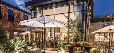
Working with architect Paul Shea, who designed the built-in office that’s hidden behind the paneled walls in the study, Clements’ latest addition to the project is a carriage house and an outdoor dining area complete with kitchen, double-sided fireplace and cable television. Giant lanterns from Mecox Gardens complete the shingle and stone space, and furniture from McKinnon Harris is on order. When it arrives, so will summer.


