It took Phileas Fogg 80 days to go around the world in Jules Verne’s classic novel. It took closer to three years for a Shadyside couple to complete their residence, a mélange of influences from their international lives and travels. The result is a journey of a different sort; a home that reflects both their global taste and appreciation for impeccable detail.
[ngg src=”galleries” ids=”115″ display=”basic_thumbnail” thumbnail_crop=”0″]
In an age when most things can be categorized with a word or two, it’s impossible to summarize the design ethos behind the house. The owners had spent years collecting ideas and photos, never dreaming a small tragedy would make use of them so soon. The home they purchased in 2005, and had just finished remodeling in 2010, caught on fire. The smoke damage was so extensive the house had to be gutted. While the first renovation worked with the existing French Provincial architecture, the fire enabled the couple to start from scratch inside and out.
They incorporated several improvements from the first renovation including an open stairway from the basement to the second floor, skylights and large glass expanses in the family room that open the house to the pool beyond. But everything, from the foundation up, was reconstructed.
The couple brought in architect Stuart Horne of Seigle, Solow & Horne to design “something that was in keeping with the aesthetic of the street but a little more open and bright,” says the wife
.
“We’d taken pictures through the years—we travel to Los Angeles a lot, and to Europe. We talked with Stuart about what our vision would be since we had the opportunity to make changes at this point. Stuart would sit down and do some drawings and surprisingly, there were very few changes.”
Contractor Will Carpenter of Carpenter Construction and interior designer Selma Sherman completed the team. “Part of what helped us was their expertise and professionalism, the ability to work with them to achieve the highest standards, especially because neither one of us had been in a fire before,” the wife says.
Given the opportunity to create a home from scratch, the couple merged their wish lists and prioritized. Since they love to entertain, having a variety of spaces that could accommodate large groups or more intimate gatherings and also be welcoming for everyday family life with three teenagers was crucial. They envisioned a more open floor plan, with an entrance hall that connected the other entertaining areas but that could also handle a crowd.
To that end, a vaulted ceiling with cove lighting and a clerestory window was created to add height and glamour to the room, while a curved grand staircase was constructed off to one side to keep the room open. A spectacular custom chandelier from Wired Custom Lighting in New York City was centered to be visible from the outside as well, and beneath it the Biomorphic Console by Tony Duquette anchors the hall.
“It was all about making the house a great entertainment space,” continues the wife. “We opened the living room up to the entrance hall—before it was closed off. We have two tables in the dining room that can open up to accommodate 20 people. We wanted a lounge type of feeling in there, someplace where you could come and sit, a place where hip people could hang out. We put a catering kitchen in the basement with nice appliances and warming drawers and everything a caterer would need so they could leave the kitchen untouched during a party.”
But the couple’s vision extended beyond the logistics of how they wanted their home to function. They were equally interested in how they wanted it to look.
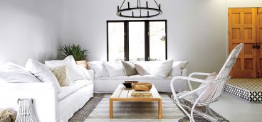
“Everybody likes to go in a certain direction,” notes the husband. “But we really wanted to have different kinds of atmosphere in the house. We wanted an English office where you could have a cognac at night. We wanted to walk to the dining room and have a Moroccan feel, a little Middle Eastern. We wanted to go to the family room and have a modern look, more L.A. or San Tropez. Open, white, colors—when we entertain or when teenagers are in the house, we wanted to change the mood and environment. We like to go from one place to another. Different rooms, different moods, a combination of different cultures.”
The wife had worked with Sherman on one of her offices, and they had a bond that made the process of decorating much easier as they traveled to Chicago and elsewhere to select the furnishings. “Selma could get into my brain. She’s as OCD as I am,” says the wife, laughing. “We made the entire house a smart house. Selma and I would look everywhere and say, ‘The smoke detector goes here,’ where it’s hidden.”
State-of-the-art technology (the brain of the house is backed by several generators) hides the home’s mechanics and contributes to its overall sleekness. Brad Turner of Easy Access Technology handled the smart house integration using Crestron and Light Touch. There are no traditional light switches in the house, just controls for different time and mood settings and for the speakers that are wired throughout the home, though faux-painting conceals them. And everything can be controlled by the owners’ phones. Both the interior and exterior lighting was custom-designed by Hal Hilbish of Hilbish McGee Lighting Design to create beautiful effects as well as functionality.
While the couple agreed on almost everything, they did defer to each other in certain areas.
“A few rooms were very important to me—the office, the wine cellar and the outside kitchen,” says the husband. “These are things I worked more on with Stuart. I work in the early morning at home. So I needed the office to be designed for that. All the things we need in an office we have, even though it looks like an English-style office. They all exist but they are hidden so it doesn’t interfere with the aesthetics of the room.”
Of special interest to the husband was the home gym. He travels the world for business and uses hotel gyms on a regular basis, and that gave him the opportunity to compare many different systems. He chose Technogym, which he describes as “the Armani of gym equipment.” Horne went to New York twice to meet with the company, working with them to ensure the perfect home system. The husband even noted how lights would shine in his face at some gyms—but not his, where they are covered. The fitness room boasts 10 windows, the result of closing in an existing balcony, with remote-controlled Lutron blinds.
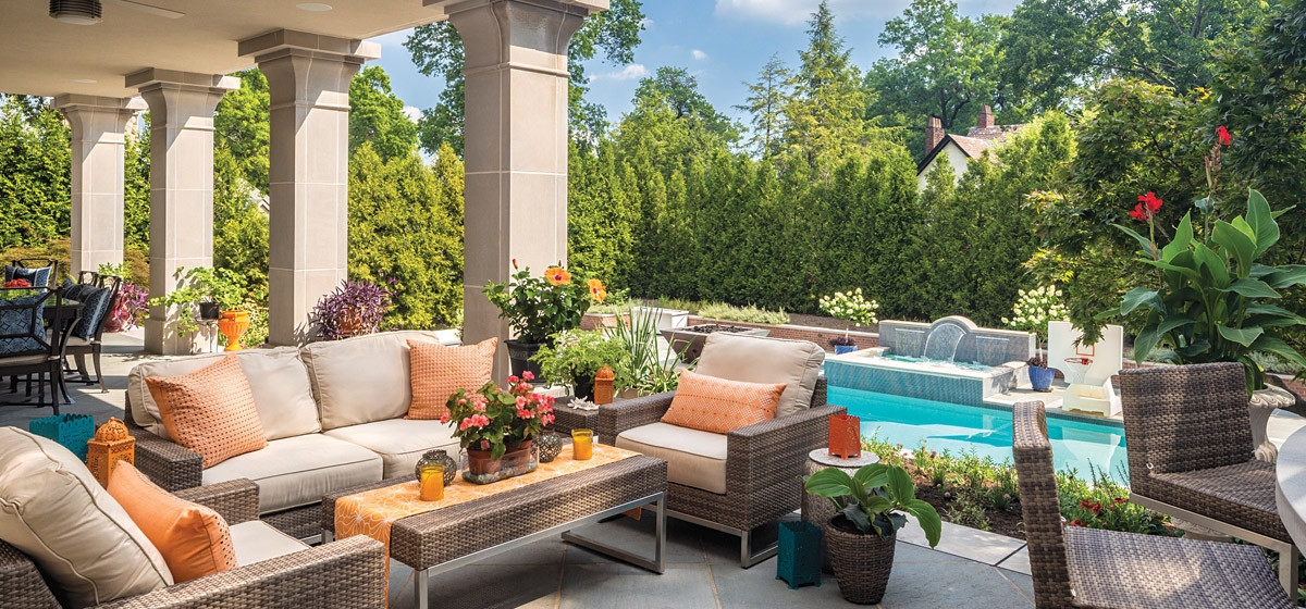
Custom details abound in the home, from the heavy mahogany doors with hidden hinges made by Boswell to the grapes on the iron and glass gates in the wine cellar—so well insulated it survived the fire virtually intact. Many of the furnishings are also custom, including a bar and exotic wall unit in the dining room. A feeling of quiet elegance pervades the home, but so does a casual quality that makes it inviting. The entire rear of the house has glass walls and doors that open to the renovated pool, pool house and new terraces for dining and relaxing.
Horne felt the existing columns in the front and back of the house were out of proportion, so they were enlarged and arches were added to give the entrance more impact. The home is faced in limestone, with brick on the second floor “because we didn’t want it to have that mausoleum look,” jokes the wife.
During the three years of planning and construction, the couple made only one or two change orders. The wife credits weekly meetings with the team as well as the couple’s research (they had folders for each room) for the smoothness of the job.
“Between the genius of Stuart Horne and the craftsmanship of Will Carpenter, it was a nice collaboration and it made the process much easier.”
“I’m thankful every day when I pull in,” she continues. “I’m happy to be home all weekend. We wouldn’t change a thing!”


