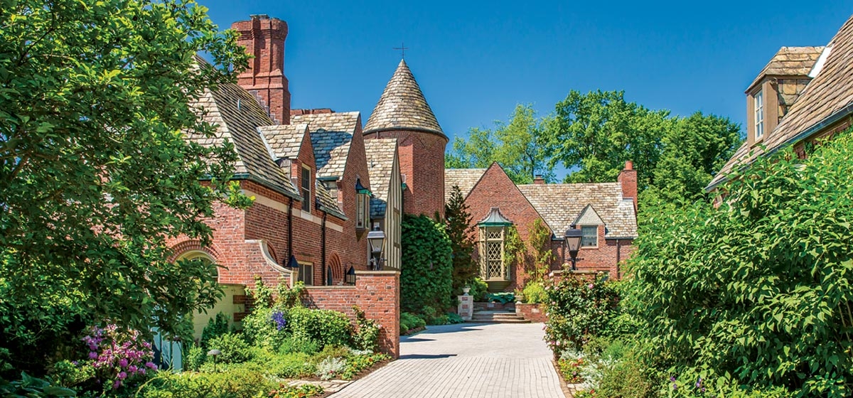
There’s a hand-drawn map of old Fox Chapel that shows the original estates, scattered here and there on the great pieces of property they once commanded. Many of the homes were weekend or country places the wealthy used as a respite from smoggy Pittsburgh; with better transportation they became primary residences and were built as such.
[ngg src=”galleries” ids=”123″ display=”basic_thumbnail” thumbnail_crop=”0″]
Some of those grand homes still stand, with acreage that is reduced but by no means insubstantial. They don’t come on the market often, but when they do, they sell in a second. The architecture and the quality of the construction in the early part of the last century are rarely equaled today. That said, old houses can require serious attention.
Such was the case with the home purchased more than 20 years ago by a couple with three small children. It was designed by Brandon Smith, the architect of choice for those who favored some sort of baronial splendor. In his lifetime (1889 –1962), he created many western Pennsylvania landmarks, including the Fox Chapel Golf Club and Shady Side Academy. His residential work was marked by impressive exteriors but livable, even intimate interiors.
The couple bought one of his masterpieces, a stately home that sits high on a hill with a magnificent view. On the Fourth of July the family can see the panoramic view of a dozen fireworks displays, but in the foreground are miles of bucolic green. It was built in 1928 for W. Forman and Florence Croft Bickel and remained in their family until 1957. By 1998, the home required substantial updating.
And so the couple set about a year-long renovation, bringing in architects Paul Shea and Lisa Simone to create family-friendly spaces and oversee major repairs to the infrastructure.
“My husband and I grew up in old houses and we just loved the comfort and the beauty of an old home,” says the wife. “We were considering putting an addition on our previous house when this came on the market. We looked at it many times and we just loved it—the architecture, being high on a hill, the view, the privacy, the beauty of the house.
“We loved the character of the home and all of the woodwork. We didn’t want to change all that and make it modern. We did not do things that changed the flow of the house, but we did remove a lot of doors that compartmentalized the house. During the Depression years they used them to close off part of the house. We did work on most of the rooms, with the exception of the dining room, which had a beautiful relief on the ceiling, and the entrance hall, which had a terrazzo floor. We also left the study as it was.”
The most extensive work was done on the second floor. A mother-in-law apartment was reconfigured to include a bedroom, guest room, spacious laundry room, and a second family room for the children. The downstairs had a series of small rooms clustered near the kitchen but most of it was formal, including an expansive Federal living room and an Adams -style dining room with rich neo-classical details.
Furnishing such a large house was a bit daunting even though the couple already owned many antiques and family heirlooms in addition to the contents of their old home. They made the decision to retain designer Gil Walsh. “I knew Gil as a f riend and I loved her home in Ligonier, her colors,” says the wife. “It just spoke to me.”
“They took a beautiful, existing home and brought it back to its glory,” says Walsh, who is now bas ed in Florida but works all over. “It was a young family at the time and the wife wanted it to be an elegant, fun, colorful family home that was very, very comfortable. If you have fantastic architecture, you have the envelope. We merely put together furnishings and fabrics that met the needs of the family. They really embrace color and they love life.”
Walsh started with some colorful custom rugs and built from there. Buttery yellow strie covers the living room walls, all the better to show off the Aaron Gorson painting “Mills at Night” above the mantel. A mix of antique and new furniture fills the rooms, and an eclectic art collection including paintings by Leroy Neiman, Allen Tucker and the husband’s grandmother cover the walls. A leopard carpet from Stark leads the eye up the open staircase: “I wanted a neutral—it goes with everything,” says Walsh.
What’s most remarkable about the home is the number of doors, mostly French, that lead outside. Almost every room opens to the exterior, with good reason. The original gardens were designed by Ezra Stiles in the late 1920s, but when the couple moved in, only the outlines were left. The house was also quite dark, and more than 20 trees were so close that they had to be removed. The Belgian block that covered the courtyard had heaved over the years and was replaced with a more child-friendly surface and the stones were recycled as borders for the flower beds and driveway. With a fresh canvas, the couple set to work reclaiming the gardens and planting new ones. Today their garden is listed in the Smithsonian’s Archives of American Gardens.
“All of the landscape had to be redone, but it was easy at the time,” says the wife. “We added yard because there wasn’t much and created beds in the walled garden, which is where they originally hung their laundry.”
The couple brought Diane Devore Associates in from Connecticut, who created beds in the courtyard to soften the entrance and planted the walled garden. But it was really Ed Shirey, a self-taught gardener who had worked at Phipps, who did the bulk of the plantings and maintained them for years. He created blue and white and blue and yellow gardens with spectacular delphinium, shade gardens and numerous plantings that have matured through the years and complement the home’s architecture. Roses climb the entrance columns, wisteria adorns a balcony, ivy covers walls, old steppingstones are rimmed with flowering ground cover and giant hostas and boxwood frame the foundation.
“I love this house,” says the wife. “I love the gardens, I love to be outside. There are so many windows I can look out and see the gardens, which are all around. The house opens up onto these areas and it just lends itself to entertaining. Each garden area is like another room. It’s beautiful to entertain here.”


