From the outside, the Tudor home looks as if it’s always been comfortably nestled on the leafy street in Sewickley. That was important to architect Douglas Devlin, whose challenge was to fit a new residence into an established neighborhood without disturbing the aesthetic.
[ngg src=”galleries” ids=”51″ display=”basic_thumbnail” thumbnail_crop=”0″]
“We weren’t technically in the historic district, but we were on the edge of it,” Devlin says. “We didn’t want to put something there that didn’t belong. And we had to get all the spaces in a deep plan, not a wide plan. The house is 13,000 square feet, so we were concerned about the scale. We didn’t want to overwhelm either of its neighbors.”
The owners wanted their children to be within walking distance of their friends, the shops and the schools, which is one of the charms of this quaint village. They requested a home that was spacious enough to accommodate different kinds of entertaining, that had a formal library and a loggia that could adapt to any season. Also important was the large art gallery at the rear of the home.
After researching nearly 100 architects, the owners narrowed it down to several before coming to a decision. Among them were bigger names who had done fabulous projects, but they chose Devlin Architecture, which they described as “a young, fresh firm.”
Devlin was excited by the opportunity the project offered. He worked closely with his new clients on the details, the many touches that make the home both special and beautifully functional. The owners contributed to the major design elements, including the two-story library, the paneling and the way the gallery is integrated into the floor plan. That the residence was completed in 21 months—the summer of 2005—becomes more astonishing when one considers the quality of the construction overseen by the architect and builder Jim Dunlap.
Take the elliptical entrance foyer, which Devlin cites as the most distinctive space in the home. “It seems simple and small, but it’s very gracious. The moldings, wood paneling and stairs are all curved, and we camouflaged the closet doors. There’s no doorway in front of you, so you don’t know what else is in the house. It’s what the Italians call fermata—a contemplative pause. You’re forced to stop and look around and appreciate the detail.”
From the leather coffered ceilings to the burnished wood trim, the abundance of limestone, brick and marble, the custom doors and carved fireplaces, even the way the wood floors change from parquet to planks, the residence is an homage to the kind of traditional craftsmanship one seldom finds in new homes. “We were able to detail every room to the appropriate level so you don’t walk into any room and feel it was downgraded,” Devlin says.
Yet the details don’t demand attention. They create a serene but substantial background for the furnishings, which echo the purity of the design. The owners brought interior designer Thomas Pheasant in from Washington, D.C., to select the finishes, colors, fabrics and furnishings. They chose Pheasant after reviewing a copy of Architectural Digest’s 100 Deans of American Design and felt an affinity with him because both had apartments in Paris.
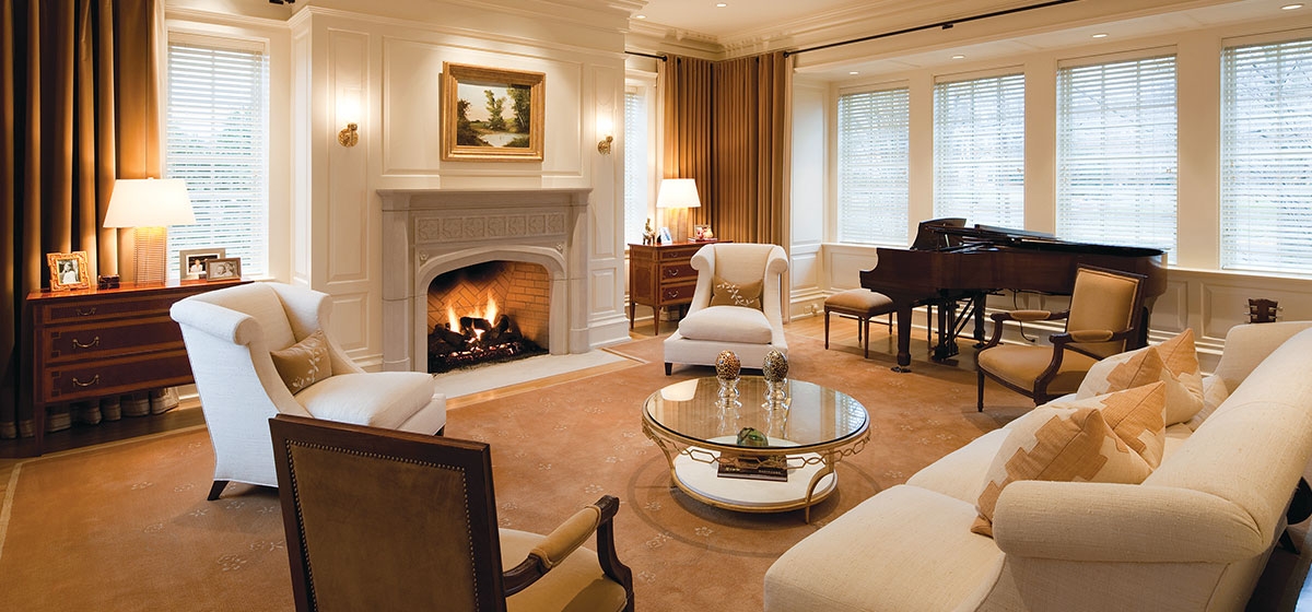
Once Pheasant was selected, they worked with him to create a home that is at once relaxed and sophisticated. They were attracted by his use of classical pieces with clean lines and simple fabrics emphasizing tone on tone. They gave him a verbal picture of how they wanted the rooms to feel—for example, people around a piano in black dresses and pearls in the living room. Or the rich, warm colors in the family room—the predominant color was inspired by an Hermes handbag.
Pheasant says that “it’s very hard for me to say no when people are complimentary about my work,” adding that the Paris connection was a factor for him as well in taking the job. So was the open dialogue the owners kept with the architect and Pheasant, who came into the project when it was under construction.
“The owners appreciate the design effort and the value of creating dramatic and beautiful spaces,” Pheasant says. “Investing in the architectural qualities of a building increases the value of the decorating ten-fold.” Though the house was unusual in that it had so many dramatic spaces, Pheasant says the only real challenge came from the vertical configuration of the library. “Even though it was very tall, you still want it to feel cozy even if only two people are in it.” The owners have had a red room in every house and wanted a red library, finding the color both warm and stimulating.
Pheasant has created several furniture collections for Baker and McGuire and used many of his pieces in the home, noting that roughly half of the furnishings were purchased for the project. The rest came from the owners’ previous residence, including the dining room table and antiques such as the chests in the living room. Though the pieces he has created for Baker clearly represent his design sensibility, using them was not in any way mandatory.
Pheasant says his primary concern is choosing the right furnishings for a home, regardless of where they come from. To that end, he asked the clients how they were going to live in the residence and took a very practical approach. For example, he likes to use standard colors, such as Benjamin Moore’s Bone White on the trim, recognizing that active families will cause the woodwork to be re-painted on a regular basis. The end result exceeded the owners’ expectations. With such luxuries as a wine cellar, a game room, a media room with stadium seating, an exercise room and even an elevator, no component of modern living was neglected. Says architect Devlin, “It’s as close as we’ve ever come to making architecture art.”
The residence is currently on the market. For information, contact Howard Hanna Realty agent Mia Kail-Bojalad, 412-741-2200 ext. 213 or mkail@howardhanna.com.


