The Curated Condo

When Karen and Jim Johnson decided to downsize, what they had in mind was not a smaller version of their large property in Churchill. The couple wanted a complete change, from traditional with antiques to contemporary with all new furnishings.
[ngg src=”galleries” ids=”101″ display=”basic_thumbnail” thumbnail_crop=”0″]
“We only brought three pieces from our other home – the piano, a marble-topped table and a demi lune console,” says Karen. “I decided that we would work them in. I never want my house to look like a period piece. I wanted an accumulation of things that I like and my husband likes.”
What they had accumulated, in fact, was a substantial collection of important modern art. That became the starting point for a design process that led to 10 months of work on a raw space in a new building in Fox Chapel. The couple chose their condominium after looking around the city for something they could convert, only to find that the most desirable places were already gone. But that turned out to be their good fortune. Their new residence is close to Jim’s office – he owns a road construction company – and to their son and his family.
The bonus was that the condo is on the river, with sweeping views in two directions from the corner unit. Tall windows line the living room, providing lots of natural light and a sense of openness that is often lacking in condos. A walled terrace outside provides immediate access to nature, not to mention a private place to grill and dine. Having all the amenities of a house without the maintenance was essential to the couple. They also have homes in Vail, Colorado and Scottsdale, Arizona, where they spend a great deal of time when they aren’t traveling to more exotic destinations.
Yet it was the opportunity to start over that most attracted them to their new residence. A blank canvas, so to speak, in which they could hang their many paintings and create a gallery for living.
The Johnsons brought in Melissa Greenauer, a designer whom they had used in Vail and who also has offices in New York, Miami and London. Karen admits that she’s particular. “Show me 1,000 swatches, and I’ll ask for 10 more,” she jokes. But she knew she could work with Greenauer and loved the space she had created for them in Colorado.
“Generally speaking, I knew I wanted a look that was contemporary, sophisticated and more elegant than earthy. The bedroom had to have lots of storage and walk-in closets, and a pantry or wine closet was a requirement. I needed a place to store things, and I also wanted a bar for entertaining and a studio,” says Karen, who enjoys painting.
Greenauer redid the entire floor plan so that it would satisfy the couple’s desires. But when they laid out the space, they found they needed more. So the builder sold them additional footage, bringing the total to 3,600 square feet, or roughly a condo and two thirds. “It was an envelope, and we started to lay it out the way the building was designed, and it didn’t work for us,” says Jim. “All of the units were designed with a today look, the kitchen and open family room. We wanted a more traditional look with separate rooms. And because we were on the first floor with the plumbing below us, we were able to move it around.”
A major consideration throughout was planning for the art. Karen was an art history major and a docent at Carnegie Museum of Art, while Jim is on the CMA board and a trustee of all four Carnegie museums. The couple has been collecting seriously for about 15 years. “Once in a while I buy something she doesn’t like and it gets banished to my office,” Jim laughs, adding that most of the time they agree. Their collection includes works by William Kendridge, Ed Ruscha, Phillip Pearlstein and Jeff Koons.
“We pretty much knew before it was built where everything was going to go,” Jim continues. “Anything that was of any size – like the painting in the front hallway, that was the only place it could go.”
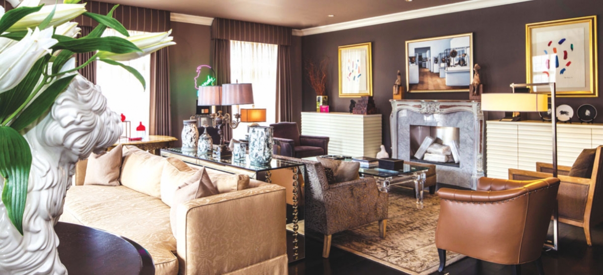
Working with Greenauer, they chose quiet, neutral colors and avoided any strong patterns, opting instead for variations in texture. They asked that the furnishings be interesting but understated, and spent a great deal of time in the New York Design Center finding just the right pieces and selecting the Stark carpeting. But the Neff kitchen was locally sourced at Kitchen and Bath Concepts, and it achieves that rare balance between cool and comfy.
It was Greenauer’s idea to add the neon accent lighting above and beneath the cabinets and the island, and to use painted glass on the walls on either side of the cooktop. It was the Johnsons who requested an island big enough “so if you have people in there and you’re preparing a meal, you can interact and have conversation and not have your back to people,” says Jim. A long, narrow sink in the island doubles as a place to keep wine chilled for parties. And here, too, there is art: a painting of the kitchen at Fallingwater by Felix de la Concha.
The condo flows from private space at one end to public at the other – a generous living room with several seating areas and a corner bar well stocked with style. When the Johnsons are home alone, they use the den with its leopard rug and long sofa for stretching. The dining room features a red glass chandelier that matches a red lacquer buffet made by Ken Hall, and more art. Running through the condo is a long hallway that doubles as a gallery and provides a sense of entrance to every room.
For all its drama, the Johnson’s home has warmth and the personality of an interesting couple who live with what they love. Even if it’s only for a few months of the year. “I love the fact that it’s truly turnkey,” says Karen. “When we’re ready to go to our next location we literally just close the door. That’s an enormous help. It just makes life easier.”


