A Period Piece

Perched on a hill in Oakland is a classic 1920s apartment building with spectacular views and a roster of illustrious residents. Many of them have undertaken renovations to bring their co-ops into this century, and the results are as varied as the inhabitants. But one particular resident split the difference by hundreds of years—she updated her two-story space and then furnished it with a collection of mostly 18th and early 19th century American and English antiques.
[ngg src=”galleries” ids=”154″ display=”basic_thumbnail” thumbnail_crop=”0″]
By respecting the architecture and, in many cases, precisely duplicating the details, the owner was able to restore the apartment to its original condition. When she purchased the residence in 2013, it appeared never to have been renovated. Worse, it had not been lived in for seven years and the neglect was apparent. But she could see the potential. And then there was all the greenery—the apartment was eye-level with the treetops outside, bringing nature in. That was important to the owner, whose former home had a magnificent 10-acre garden.
“That was very appealing, seeing the trees out the windows,” she says. “You’re in an urban setting yet you see these big, old beautiful trees.”
The windows themselves were another matter. They were the originals, a combination of metal frame casement and wood double-hung windows, and almost none was functional. So an early first step was replacing them all using Pella’s Architectural Series. A new heating system followed, along with an update of the electrical system. Some of the work required the addition of bulkheads, so the owner decided to use them as a design element and added more to keep the ceilings symmetrical. French and pocket doors were also installed as space savers, and for convenience and privacy in the master quarters. With the basics covered, she was ready to tackle the aesthetics.
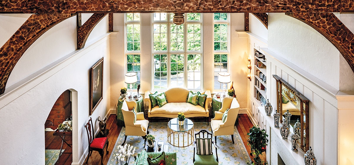
“The apartment was so dark, but I thought I could figure out how to lighten it,” she recalls. “I loved the fact that the bedrooms were on the second floor because it felt more like a two-story home. And the apartment overall has wonderful circulation—the flow of the rooms is really efficient. Initially I hated the living room because it was the gloomiest and darkest room of all. The bookcases, the massive beamed ceiling, and floor were almost black.”
She began by painting everything white, and that’s when serendipity stepped in. Though she originally planned to paint the ceiling beams as well, they needed to be sanded first. “I had somebody on the scaffolding with a circular sander and it looked really cool.” Because of the beam’s irregular texture, the sander hit the high places first, creating a leopard-skin effect. The owner liked it so much she decided keep it that way. When the white ceiling looked too stark against the beams, she had the fresh paint sanded to match.
Throughout the apartment, the floors were sanded and bleached in order to create a lighter ambience. Much of the woodwork was also in bad condition, so it was easier to replace most of it. George Hall Lumber in West Homestead replicated the mouldings with knives, which are metal templates used to copy the originals. Then it was on to the real business at hand—re-configuring the spaces to accommodate modern living.
“There was a kitchen, and a maid’s bedroom and bath and pantry, so I made that all one big kitchen and sitting room,” the owner says. “There was no powder room. Instead there was a card room with a little built-in closet for the card tables. It was perfectly sized to line two card tables up. The master bedroom was called the study, and there was a third bedroom with a bath. I combined that with the master bedroom to make his and her baths and a dressing room.”
White Italian marble was used in the baths and the kitchen, which has 12 x 24 floor tiles in keeping with the scale of the apartment. “That was a decision I made throughout, because of the large scale of the principal rooms and their wide-plank wood floors.” The owner is an attorney and a former art and antiques dealer, yet the renovations were not done with the idea of showcasing her extensive collections of both.
“I am very fond of my sculptures and paintings because many of them came from my father. I like to have them around wherever I live because I know the story of how he acquired each one, and his stories always inspired me and made me laugh. I was a little worried about finding a home where my rather formal furniture would look good, but when I saw the apartment, I knew it would work.”
The warmth of old wood, brass, copper and gilt is juxtaposed with a colorful palette inspired by her former gardens. Greens, yellows, reds and blues predominate in the rugs and fabrics, all chosen by the owner. Gary Bowers Designs crafted all the window treatments and Richard Hayes did the upholstery, much of it on antique chairs and sofas. Setting the tone in the living room, dining room and entrance hall is a colorful floral rug from Stark the owner first saw 15 years ago.
“I was on my way to The Masters when I stopped at the Stark carpet outlet in North Carolina and found a rug for my previous home that I just loved. The problem was that it cost $20,000, and I couldn’t afford it. When I moved here I still had that sample and, lo and behold, they still had that carpet. I got it all for a fraction of the original price. I had lived in a garden and knew I wasn’t going to have a garden so I wanted everything to reflect that. The trellis wallpaper, the floral fabrics, trellises on the sofas and roses on the carpets.”
Indeed the residence does have a fresh, garden-like feeling. The owner loves the convenience of the apartment, the privacy it offers and the gracefully sized rooms. But most of all she loves the light that makes its rounds during the day. “I think it’s really cheerful,” she says. “And the light just adds to that.” Because the owner has bought a house, her apartment was recently listed for sale.


