The homes on this leafy street are quintessentially Shadyside, which means an eclectic mix of periods and styles. Though all are grand, one stands apart from the rest with quiet dignity. Painted white from top to bottom, the pristine exterior accentuates the symmetrical lines of its columned entrance, the three sets of French doors, and the boxwood shrubs that edge the limestone terrace.
[ngg src=”galleries” ids=”66″ display=”basic_thumbnail” thumbnail_crop=”0″]
It seems almost shocking when the owner points out two neighboring homes and says the three were identical when they were built in 1905. They still boast the traditional dark, covered porch, the ruddy brick, and the undistinguished quasi-Georgian facades. The white house, however, shines with light and youth, delighted with the facelift that has given it beauty far beyond what it ever possessed. Step inside and the ghosts of any industrial past have been banished not just from time, but from place. The house immediately resonates with the unmistakable Southern charm of New Orleans. The couple lived there for some years, and the lady of the house, who directed the renovation and decoration, honed her hobby at the hand of renowned New Orleans designer Michael Carbine.
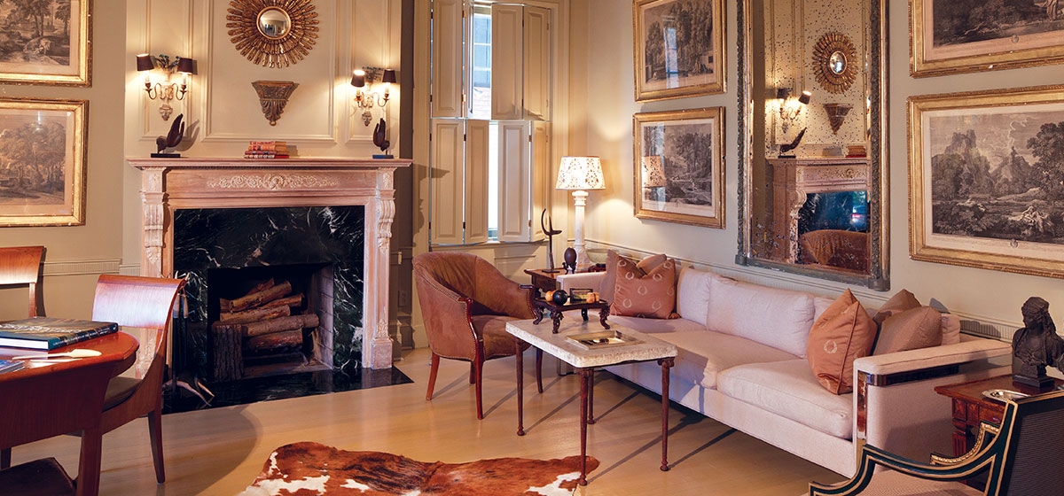
It’s not that she wanted to re-create the Queen Anne they had owned in the Garden District when they moved to Pittsburgh in 1991. But the distinctive elements of the New Orleans vernacular very much suited her personality, beginning with the use of a monochromatic background. The entire house—walls, trim and ceilings—are painted in variations of a warm taupe.
“I could not live in a house that was not the same palette,” she says. “I’m a quiet person and I don’t like a lot of color around me. It’s soothing mentally. I love to move furniture around, and the similar colors allow me to change rooms easily. I can use accessories to change the feel of a room. I can use red in the living room, but I don’t have to because there’s no red in there.”
The secret in making one shade interesting is using assorted finishes for the paint, so that each surface reflects light differently. The hall, living room and dining room are Benjamin Moore’s Adams Gold, the kitchen is Alexandria Beige, the library Pittsfield Buff and the master bedroom Navajo White. Yet a casual observer would be hard pressed to tell them apart, or to detect which walls were painted with a reduced formula of each color.
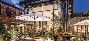
When the owner worked with Carbine on the couple’s beach house, she fell in love with his use of neutral color. “You don’t really want to know what the color is—is that gray or mouse brown? It makes everything go away so furniture and objects can sing.” Carbine is now a close friend and helped to choose the colors and arrange the furnishings in her Pittsburgh residence. And though she has worked with several local designers over the years, she credits Mark DiVittorio with the most important decisions. He designed the front porch, removing the old structure and adding the portico and stone terrace. DiVittorio also designed the garden room that now serves as a favorite family gathering spot, and the adjoining rear terrace to go with it. His painted faux finishes—considered the best in Pittsburgh—can be found throughout the residence.
But the house itself was chosen by the husband. “I bought the New Orleans house so now it was his turn,” the wife jokes. He wanted a three-car garage and a city setting close to his office. That accomplished, she proceeded to gut the home. “There was nothing in the house that we kept. We bought it because I like to re-do houses and it was a challenge to pull this all together. It’s something I enjoy doing. I know people think I’m insane! But it’s like giving birth, I guess. You think about it, move things—it’s the act of creation. And it’s much more satisfying than buying a dress!”
Though the floor plan is basically the same, a few walls were added and others removed for better flow and to create a master suite. The bathrooms were updated and surfaces throughout the home were rejuvenated while the couple camped on the spacious third floor. An oval arch that echoed the others in the home was added to define the master suite entrance, and a passage from the den to the bedroom was closed for privacy. Perhaps the biggest change came in the front of the house, which had double doors for an entrance. They were replaced with oversized French doors, and windows in the flanking living room and library were turned into matching doors for symmetry and light.
When the dust settled and the paint dried, it was time for the owner’s favorite part of the process. Luckily, she already had almost everything she needed to furnish the residence. Much of the furniture, art and accessories are family pieces, but others are antiques ranging in quality and condition. That’s part of their charm, and what gives the home a feeling of comfortable, relaxed elegance.
“I got a lot of things in New Orleans—at least 60 to 70 percent. It was wonderful. We lived there in the heyday of the auctions, before the telephone bidding. There were three auction houses and you could pick up wonderful things. It was all kind of beat-up already, so it had this wonderful patina. I think the beauty of the mirrors is the loss of silvering on the back. The thing about having old things that have a patina is you don’t have to worry if the kids put a ding in it. That’s part of the beauty of aging.”
While she prefers modern art and her husband likes Old Masters and Scalp Level artists, they compromise by having both. They also focus on paintings and prints rather than glass or sculpture. Jade bowls from China and other pieces picked up during their travels accent the home, but so does a Formica credenza bought at Construction Junction. The owner’s ability to see an object for its beauty, and to find beauty in the most unlikely places, is testament to her refined taste. And so it was that a gloomy old house became a wonderful and serenely warm home.


