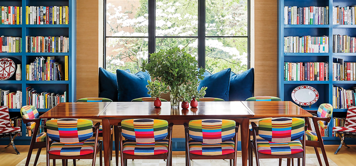
The Shadyside home interior designer Colleen Simonds created for her family seems to radiate with vibrancy and joy. A riot of color, light, pattern and design envelops the residence, which was formerly a traditional, 1911 Colonial. At once youthful and sophisticated, the home is unabashedly personal.
[ngg src=”galleries” ids=”377″ display=”basic_thumbnail” thumbnail_crop=”0″]“It’s kind of a family joke. When we bought the house we thought it just needed a new kitchen,” laughs Simonds.
Simonds and her husband, Henry, an artist, had been house-hunting for some time once they made the decision to relocate from New York. Both are Pittsburgh natives, and with two young sons they wanted to be near family and enjoy a different lifestyle.
“Finding a house was challenging. We were more focused on being in the city to be convenient to school, and the walkability was nice. Coming from New York, it was what we were used to. But everything we looked at was 100 years old and needed a ton of work. That was a bit sobering. I had no understanding of how much work this house required.”
Fortunately Simonds was prepared for the project ahead. A former buyer for J. Crew, she was ready for a career change and enrolled in an associate degree program at Parsons School of Design. She opened Colleen Simonds Design in 2011 and though she worked part time for several years as her children were born, she had never done a major renovation.
“What initially attracted me to the house were the high ceilings, and it was in good shape, it showed well and was very well maintained,” she says. “I could just see it was a blank box and it had the potential to turn into something else. You can’t make a Tudor into something else. Some houses are just going to be what they’re going to be. But most of the bones were there, and it had the potential to be something different.”
She also wanted something a bit contemporary. The house was clad in white siding, and one of the first steps was replacing many windows with larger, sleeker versions and covering the exterior in dark Hardie board, running vertically. It’s easy to see how one project led to another. With the help of Moss Architects and contractor Jim Marshall, Simonds reconfigured the conventional interior to reflect a more modern usage, opening up the home so that it flows almost seamlessly from one room to the next.
“We don’t have unused spaces here. In a way, we have two rooms on the first floor,” Simonds notes.
Though the center hall still divides the space, walls were removed to create two large spaces. One is essentially a living space, a combination family and dining room. On the other side of the hall is the new kitchen with a casual dining area. A long breezeway was built to connect the home with the garage’s new upper level, which was added to serve as Simonds’ home office.
“Things really started to snowball and get a lot bigger than we bargained for. The old house had a detached garage down below, and I thought I could put my office on the second floor above it. But we were unable to get approval for the height variance that required, so we dug down. Doing all that excavation was a huge amount of work and time and money. We lived in a mud pit for a year and had to do all the stone work and it took forever!”
But the result was worth the effort. Simonds’ office is a large, airy space and the breezeway, with its heated floors and ample storage, is a well-used addition off the kitchen. The kitchen itself underwent a major transformation, with a giant new window over the sink opening a welcome view. Some existing windows close to the neighbors were covered over, creating space for a bar. Soapstone counters rest on custom cabinetry by Larry Flock of Greensburg. Simonds didn’t want to paint everything white in an already bright kitchen. She loves navy and chose Farrow & Ball’s Railings, a very dark, almost black blue, for all the cabinetry knowing she wouldn’t tire of it or find it trendy.
Next to the kitchen is just one example of the exuberant wallpaper that injects a playful tone throughout the house. The children’s rooms feature a forest of birch trees, pinstripes and blue camouflage, while the powder room has an abstract floral by Hermes. A wonderful surprise is the ceiling of the breakfast room—it’s covered in a favorite fig leaf pattern by Peter Dunham Textiles, in blue of course.
“Looking at the whole room, I thought about where I could add pattern and color. Ultimately it was a chance to do something on the ceiling and it draws your eye up. I’m always drawn to organic patterns with leaves, flowers and birds, and this one feels like a more contemporary floral. I knew it would be the right thing up there and connect to the darker blue on the cabinets and be fun.
“That’s what I try to do for my clients. I think things can be sophisticated but not boring and serious. Most of my clients are young families. We’re a young family and I don’t want to live in a house where you can’t touch things. The fabric had to work for the kids. The ottoman is covered in a hide so we can put our feet up on it and the kids jump all over it. The couches had to be comfortable. My husband is a person who lies down on couches, not sits. Color helps my mood. It feels like a happy, fun, warm home.”


