Nestled comfortably at the intersection of Schenley Park and the Junction Hollow Railway, at the border of Oakland and Squirrel Hill, the campus of Carnegie Mellon University could appear as a serene grove of academia, where eminent professors and industrious students perambulate through green spaces from one building to the next. In fact, a remarkably partisan architectural debate takes place on this campus, moving at the slow pace of decades, but legible nonetheless.
A new addition to the campus student center, recently named after widely revered outgoing president Jared Cohon, is the latest entry in this multigenerational dispute.
With its first buildings beginning in 1904, Carnegie Tech embraced an eccentric but decisive version of Beaux Arts style. Architect Henry Hornbostel used the mode’s traditional evocations of Renaissance and Roman building while adding unconventional but welcome references to industry that suited the school and the city. Palace and temple-like building façades in purposeful yellow brick enclose heavy-duty lab spaces for machine tools and scientific experiments. Crucially, these buildings align and connect with each other visually, as part of a greater master-planned composition at the scale of campus and landscape.
After World War II, modern architecture ascended, and a generation of austere boxes took shape on campus as exemplars. Hunt Library, Scaife Hall, Donner Hall—these are invariably metallic and rectilinear, with any reference to historical profile or detail strictly forbidden. They likewise imagined themselves as isolated objects in large fields, even if they actually had close neighbors. The worst among them can seem alienating, even in an architectural crowd.
The pendulum swung back dramatically in the 1990s, as lingering tastes for postmodern architecture brought sensibilities back much closer to Hornbostel’s original designs. Architect Michael Dennis, who designed several pivotal campus buildings, describes in his book “Court and Garden” how he admires the capacity of French Baroque architecture (the ancestor of Hornbostel’s Beaux Arts) to give articulated, interconnecting shapes to all spaces, indoors and out.
So the student center, completed in 1996, is organized around an emphatically Parisian forecourt facing campus and a correspondingly aristocratic interior rotunda. Along the side, the building’s long loggia, partially mirrored by Dennis’s later Chosky Theater across the “Cut,” gives precise shape and a pleasant covered walk to a previously undefined campus quad. (Student criticisms at the time that the buildings were authoritarian were misplaced and overblown.)
Strangely, though, the student center largely faces away from Forbes Avenue. The loggia ends in a pleasantly layered three-story façade, but that only hides a doorway leading to a small upstairs café, not the sort of large public gathering space a university might otherwise place on its main urban street.
Otherwise, the blank backside of a large assembly hall faces the street and recedes from it, leaving room for an undistinguished loading dock and vehicular drop-off. There is an entry to one of the building’s main corridors tucked back here, but it’s a little hard to find.
This building needs to face Forbes Avenue with a more prominent architectural welcome to Carnegie Mellon. The question is how. Michael Dennis’s distinctively postmodern architecture could easily suggest an addition in a very similar, historically referential style. Indeed, in his design for the Chosky Theater, Dennis cut off the building end as if with a deli meat slicer, rather than connect it to the modern Warner Hall in a conciliatory way. The adversarial relationship among architectural styles could easily have continued.
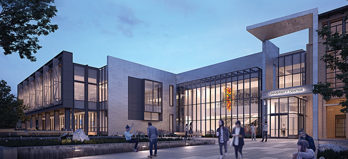
Instead, the architects Cannon Design of New York are using a modern aesthetic to add some desired functions to the student center while ameliorating some of its initial shortcomings. The best Modernism seems evergreen these days, with the added advantage of flexibility. Here, what seems like a pretty ordered project is actually a complex intersection of competing forces.
The project includes a variety of fitness spaces and exercise studios, as well as a large studio theater and entrance lobby. Spaces for lockers, student organizations and smaller performance spaces are also part of the three-level, 62,000-square-foot addition. The largest, most prominent wing is a steel-framed, glass-enclosed structure for exercise studios. The building’s lobby is another high-ceilinged, glass-enclosed space, which creates a much-needed public gathering spot along Forbes. It pulls back from the street and the exercise studios just a bit to create an entry plaza. The entrance is an extension of an existing corridor that gives it the prominence it needs. It protrudes just a bit, with a vertical ribbon of masonry folding into a two-story canopy as its accent. Its height matches the cornice height of its predecessor and gives a modern reinforcement to the postmodern neighbor.
Look more closely at the forms and details. The exercise room is a little busier than expected. These columns and mullions seem to be bolted together from a few more pieces than the most elegant brands of Modernism otherwise dictate. Also, the success of this project is going to depend heavily on the landscape design of paths between buildings and garages. Overall, though, the project has the feel of putting a front door and window on a part of the campus that has needed one for nearly two decades, if not more. And it does so in a mode that connects to all of its predecessors rather than attempting to contradict some of them.


