For the children and the community

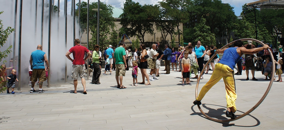
Mist emerges with an audible hiss from the vertical stainless steel poles of “Cloud Arbor,” the new artwork by Ned Kahn in the redesigned Buhl Community Park on the North Side across from the Children’s Museum of Pittsburgh. A delighted toddler runs toward it, to assess the wafting, San Francisco-like fog that collects and disperses every few minutes, and to join the small gaggle of tag-playing grade-schoolers for whom the fog seems to be it.
Nearly all of Ned Kahn’s work combines poetic and scientific ruminations on the environment. “I am less interested in creating an alternative reality than I am in capturing through my art the mysteriousness of the world around us,” he has said. The MacArthur grant recipient also collaboratively created the integrated façade of the adjacent Pittsburgh Children’s Museum, where canted screens of individually hinged, translucent 5½-inch-square shingles, 43,000 of them, ripple like the surface of a pond in the breeze. These works contribute to the sense of a quirky, benevolent wind breathing through this quadrant of the North Side, turning clouds into public art and wind into architecture. All sorts of artifacts, from oversized weathervane fish to fragments of historic architecture, reinforce the feeling.
The Children’s Museum of Pittsburgh is indeed at the center of an entire district’s pervasive cultural climate, but such a thing did not blow in effortlessly. In 1998, the Children’s Museum, housed under the distinctive Renaissance dome of the old North Side Post Office, was 15 years old, and, at 20,000 square feet, about one quarter its current size. Surrounding institutions, meanwhile, were fleeing and faltering. Next door, the Buhl Planetarium sat empty after the Carnegie Science Center had plucked most of its equipment and programs for a new facility along the Ohio River in 1991. Similarly, in 1999 the Pittsburgh Public Theater moved to the new O’Reilly Theater in Downtown’s cultural district, essentially abandoning the historic Carnegie Music Hall, two buildings over.
Eventually, the Carnegie Library of Pittsburgh, adjoining the Music Hall, would move its facilities elsewhere as well. And the park, the Historic Allegheny Square, the object of an over-ambitious 1960s redesign, had decayed into a “horrible, depressing concrete sinkhole,” says Mark Fatla, executive director of the North Side Leadership Council.
“We were either going to have to leave or redouble our efforts to reinvigorate our own community,” recalls Jane Werner, who became executive director of the Children’s Museum in 1999. Foundation support proved crucial to the redoubling. The Grable Foundation underwrote a highly successful exhibit, “Mister Rogers’ Neighborhood,” which essentially doubled visitors and seeded an endowment. Then, a Heinz Endowments-funded feasibility study determined that an expansion was not just possible but necessary. Next, in a process funded by the National Endowment for the Arts and the Benedum Foundation, the Children’s Museum undertook both a community charette and a design competition. The combination of grassroots brainstorming meetings with potentially flashy design speculations by out-of-town architects may have seemed antithetical to some, but it eventually combined the best of both processes. “You have to listen, and you have to find the common ground,” Werner said at the time, repeating an ongoing mantra. “Good design comes from listening to everyone.”
Koning Eizenberg Architects of Santa Monica, Calif., a firm with a singular reputation for down-to-earth responsiveness as well as elegant design, won the competition. Their scheme, called “Roots and Wings,” appealed to both an abiding sense of place and the aspirational power of architecture. It joined the post office and the planetarium with a restrained modern pavilion, fronted by an elegant but welcoming porch in a design that was very much like the building as it was eventually completed in 2004. They discarded the originally proposed skin of folding, translucent plastic, which had proven to be fragile and overpriced, in favor of the current screens, designed collaboratively with Kahn. “We got to know each other and liked each other,” recalls principal Julie Eizenberg of the process. The relationship turned a potential stumbling block into a successful and iconic feature.
The 80,000-square-foot, $28 million expansion opened in 2004 to widespread acclaim and popularity. The central pavilion greets visitors with a bright and airy lobby as a gathering area leads to exhibits on three upper floors. A renewed Buhl building contains workshops under the dome and a brightly lit café in the Great Hall, thanks to the judicious opening of a large new window in the east end. Other space in the Buhl provided offices for a roster of child-oriented organizations, including Child Watch, Reading is FUNdamental, the “Saturday Light Brigade” radio show, and the ToonSeum (which has since moved). These collaborations were a formative step in the goal of making the Children’s Museum the center of a campus of youth-related organizations. A full complement of artwork includes commissioned works by artists such as Tim Kaulen and Camille Utterback, as well as pieces from an existing collection. And the building’s Silver LEED certification has educational materials posted throughout the building emphasizing recycling, energy savings and natural materials.
The founding philosophy of “Real Stuff” has been a guiding idea throughout. While other children’s museums have frequently used consultant-designed electronic exhibits with push-button interfaces, the Children’s Museum of Pittsburgh has emphasized tactile engagement with actual material in open-ended, experiential learning. This has meant an art studio, a garage (with a real car), a theater, a backyard (with plants) and water play (with pools and model boats) as museum exhibits. Their usual practice is to design exhibits in-house and test them in collaboration with affiliated research specialists. Kevin Crowley, director of UPCLOSE, the University of Pittsburgh Center for Learning in Out of School Environments, also an early collaborating tenant, first worked with the Children’s Museum on the design of the Mister Rogers’ Neighborhood exhibit. He and his associates and graduate students have been close collaborators ever since.
The most recent manifestation of this philosophy is MakeShop, a space for hands-on, informal learning activities that are based in projects and making things, not simply observing them. MakeShop operates as a partnership with UPCLOSE and the Entertainment Technology Center at Carnegie Mellon University. It draws inspiration from Pittsburgh’s Kids and Creativity Network, which sponsors ongoing discussions about substantive and productive ways to incorporate technology into learning, but it participates in a larger national trend of “maker culture,” exemplified by Make Magazine and national and regional maker fairs. The free-form nature of MakeShop works because three to four specialist staff members are always present to provide as much or as little guidance as visitors need.
MakeShop technology runs the gamut from low to high. Sewing is a favorite activity, and there are numerous looms. But there are also electric motors and an analog tabletop puzzle that controls the behavior of on-screen video characters. Director of Learning and Research Lisa Brahms says, “It’s really flexible and it changes every day.” The ethos of Real Stuff and the hands-on approach of MakeShop transfer to the broader North Side. The Charm Bracelet project shares these sensibilities. A collaborative effort with a consortium of North Side cultural institutions (including the National Aviary, the Andy Warhol Museum, the Carnegie Science Center, the Mattress Factory and the Manchester Craftsmen’s Guild), the aim was to consider these institutions the “charms” of the North Side and seek creative design proposals that would link them together.
With support from the National Endowment for the Arts in 2006, the Children’s Museum invited teams of designers to make proposals for the North Side. Originally imagined as a competition, the undertaking became more of a showcase. “We wanted to choose teams that would complement each other,” explains Deputy Director Chris Siefert. Architect Felicia Davis led a team that proposed a visionary scheme to fill the Heinz Field parking lot with “solar trees.” Graphic designer Brett Yasko’s wry proposal used the gridded windows of modern slab buildings to flash personal text messages. Amid the outrageous ideas, some real projects emerged. The Charm Bracelet has seen several projects through to successful completion, and others are ongoing.
Buhl Community Park is the foremost of these. In the context of other Children’s Museum projects, its process seems familiar. It was a design competition in which the winner brought a reputation for both elegant design and responsiveness to place and community, a sensibility enhanced by the Children’s Museum. “Because of the strong connection with the Children’s Museum and the community,” explains the winning landscape architect, Andrea Cochran, “there was a much deeper level of engagement.” This time, though, the collaboration with Ned Kahn wasn’t a chance meeting that salvaged a troublesome project feature; it was a successful collaboration that was planned from the start.
The project itself is not a front door for the Children’s Museum, but rather a reinvigoration of more broadly collective public space on the North Side. Indeed, though the Children’s Museum has raised the funds for the project and administered its construction under Siefert, it remains city property.
And it looks more like everyone’s park than the captive of one institution. Its diagonal paths make connections to Allegheny Center and the Carnegie Library and Music Hall as well as to the Children’s Museum. Its paved areas host scheduled activities for a variety of surrounding organizations. Anyone can sit in the grass or on the low bluestone walls and contemplate the inscribed quotes from a variety of historic Pittsburgh figures. They can admire the bioswale with its stormwater-collecting plants and read about them in the informational plaques. The can admire the delicate modern sensibility by which Cloud Arbor turns diagonally from the North Side’s grid, as if to defer politely to gathering people and historic buildings. Or they can just run giddily toward it when the fog nozzles start to hiss. As Los Angeles-based urban designer, Charm Bracelet participant and North Side aficionado Doug Suisman observed: “If you make a place a good environment for children, it becomes a good environment for everyone.”


