What is sustainable, or green architecture, anyway, and what is it supposed to look like? The fact remains that the operation of buildings uses 40 percent of the earth’s energy resources, so construction aimed at reducing that consumption is both admirable and necessary. But do you know it when you see it? A high-tech skyscraper here and a very conventional-looking house there both claim to be green design. But if architecture is to persist as an art, we should really be able to see the distinctions in meaningful ways.
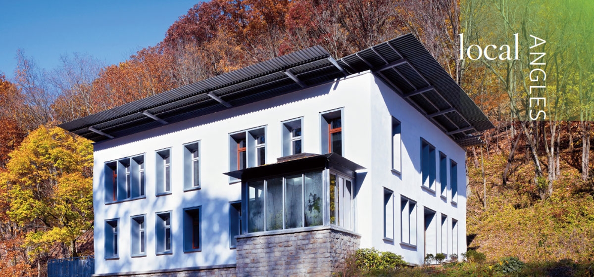
The new building for Sota Construction in Ross Township, designed by Gerard Damiani of Studio d’Arc, aims both to be sustainable and to look like it, not through heavy-handed green gimmicks, but because good architecture demonstrates rather than hides what it does. And this building engages environmental principles gracefully.
It’s no new thing. Ernie Sota, who is both the contractor and client, studied architecture and environment at Penn State in the 1970s. Today his contracting firm is perhaps the foremost green contractor in the region.
The current trend for sustainable design draws substantially from the U.S. Green Building Council’s Leadership in Energy and Environmental Design, or LEED program, which began in 1998. It provides third-party guidelines by which architects and builders can incorporate environmental features into their buildings and the increasingly familiar designations of silver, gold and platinum for different levels of success. Sota likes the LEED program well enough. “It is instructive,” he allows.
For his own headquarters, though, he was happier to follow his own environmental priorities and let the LEED chips fall where they may. “How could we use self-assembled materials to get the lowest embodied energy possible?” he wondered. This meant an emphasis on organic materials rather than manufactured ones. Most notably, the exterior walls are straw bale, which is what gives them their palpable thickness. The earth plaster covering gives them an occasionally uneven, adobe-like surface. Similarly, most of the inside walls are cob, a mixture of straw and mud, with a long history in vernacular construction. (Most of them are covered in smooth plaster, but one is left unfinished and shaped into a mural.)
Sota has worked very successfully with a number of prominent architects in the area, but the headquarters project really moved forward “when I hired Gerard finally,” he recalls. The two have one completed project together, a recent reconstruction of Sota’s South Side rooftop greenhouse, whose synthesis of angular, solar-oriented design and multi-season, passive ventilation system have earned it coverage in a number of international books and publications. Damiani is not so much a specifically green architect as he is a consistently meticulous and artful one. “The challenge is figuring out how to make a contemporary building out of these kinds of materials,” he says.
Studio d’Arc hallmarks are apparent throughout the building fabric. Materials join together with an aesthetic delight born out of their intrinsic properties. Notably, windows framed in zinc are set back into the straw bale to reveal its thickness and establish proportional relationships that relate window size, shape and placement to the overall geometry of the building. Inside, steel makes a surprising but crisply detailed appearance, serving as frames for certain interior windows and the building as a whole. Skylights, vents and raw surfaces—hallmarks of sustainable design—take on a rigorous and rationalized appearance.
The resulting building is poised at the edge of timelessness and modernity. Certainly, it’s the early 20th century modern architecture that persists healthily into the 21st, yet, it also seems like the cousin of an early Renaissance villa. This is not the postmodern 1980s, but rather a timeless sense of proportion and detail.
This suits the sustainable features perfectly, as they combine the timeless and the technological. Both heating and cooling come from the earth—six 450-foot-deep wells for a ground-sourced heat pump that serves radiant heating and cooling in the floor slabs. A sophisticated monitoring system runs its 1/8- horsepower pumps and tracks its energy use. The high insulation value and humidity absorption of the straw clay means that the system runs surprisingly infrequently. Likewise, the building has operable skylights for both lighting and ventilation, a timeless feature assisted by current electronics, which illuminate an indicator in either green or red for windows to be closed or open.
The cornices act effectively as both a sunshade and a protection of the plaster walls from rain, even as they are a significantly proportioned aesthetic element. But they are also the mounts for the building’s photovoltaics, which reduce electric bills to about $30 a month and pay for themselves over six years, according to Sota.
In the end, the builder and architect did submit the building for LEED certification. They received a platinum rating and ranking as the nation’s fifth most efficient building in that system. “The ones that beat us were much more expensive,” Sota explains. Their work shows that the synthesized goals of sustainability and artistic design in architecture can be demonstrated by a checklist, but they don’t have to be driven by one.


