The Unconventional Pays Off

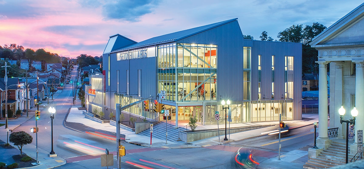
Sometimes a building aims to look as if it has always been there. Frequently, architects match the brick of the surrounding neighborhood and use slightly modernized versions of traditional details to make a structure appear that it’s been there longer than it has. This is not such a bad thing. Buildings end up being agreeable and uncontroversial. Sometimes, though, a design comes into being that calls on a different set of materials and details and a different kind of thinking than the architecture next door. At the Seton Hill Visual Art Center in Greensburg, Boston Architects DesignLab, in collaboration with BHSM of Youngstown, took an approach that departed from their immediate surroundings.
The context is downtown Greensburg, and perhaps unexpectedly so. Seton Hill University sits on an elevated green campus at the edge of town, but the Visual Arts Center is part of an innovative campaign by the university and local government to revitalize downtown with an infusion of the arts. Greensburg has suffered with western Pennsylvania’s de-industrialization of the 1970s and ’80s, and the decline of the central business district was exacerbated by the rise of suburban shopping malls. “But a Brookings Institution report [in the early 2000s] said that partnerships between universities and colleges and [small] cities could be mutually beneficial, could drive economic growth,” explains Curt Sheib, chair of the division of visual and performing arts at Seton Hill.
The university’s first downtown building was its Performing Arts Center, a brick-clad concert hall and theater with studios and classrooms completed in 2009. Its success led the university to consider further downtown expansion. The visual arts department had growing programs, and dance had not been completely accommodated in the first building, due to budget restrictions.
Over the years, Seton Hill had contemplated other proposals for visual arts, including a 1990 design proposal produced by renowned architect Philip Johnson for the main campus that did not come to fruition.
“The right building seems to come at the right time,” Sheib says. The current project moved forward definitively when the city made available the current site at West Otterman and College streets, just across from the beautifully neoclassical Otterbein United Methodist Church, and a block from the Performing Arts Center. “The city had been considering commercial developers for the property,” says Jennifer Reeger, Seton Hill’s director of media relations. “Then we came along.”
The university looked beyond the region to invite architects with national visibility to participate in a design competition. A rigorous internal study resulted in a complex program for the building with specific requirements for gallery spaces, art therapy classrooms, and studios for a broad variety of art making—painting, ceramics, sculpture, carpentry, metalwork and digital fabrication— with the specific requirements for power, data, and ventilation which these require. Also folded in were dance studios, with the need for stiff structure under resilient surfaces.
Among the seven architecture firms chosen to submit design proposals, most presented more conventional structures clad in brick or cast stone. DesignLab stood out with its factory-like proposal in corrugated metal. For principal Bob Miklos, whose father had been a foreman at Youngstown Sheet and Tube, the design recalled the functional buildings of the region’s industrial heritage. “The opportunity to draw on that was very exciting for me,” he recalls. The building also would be much more economical than its competitors, and, Miklos says, the selection committee “unanimously loved our approach and idea.”
The design also grew out of efforts to blend the different spaces in ways that would be functional while also encouraging students of different disciplines to intermingle. Many enter the building from the corner of College and West Otterman. The first floor opens with a cafe, which is flanked by two art galleries, one emphasizing faculty and visiting shows, and the other for student work, putting some of the most public functions front and center. Functions blend purposefully through the floors, with painting studios often placed on the third floor for light from clerestory windows, and offices along well-traveled corridors with classrooms to encourage chance meetings.
As the site slopes downward on West Otterman, the building’s organizing long corridor on the first floor transforms to a balcony, overlooking sculpture and other studios. Here the building’s industrial character becomes especially definitive, as the circulation path opens to the Art Yard. High studio spaces seen from above take on architectural drama, as do the staircases that open around the multiuse space.
The Art Court is multiply practical, as it opens to the street for deliveries, while serving as an important space for outdoor creative processes that might be a bit messy. Yet, it can also be the center of social activities and events.
Miklos likes the close relationship the building has to the sloping site. “It was a challenge to fit these spaces in on the sloping street, but we did it.”
The new facility has been a great success with students, and arts enrollment has increased. Similarly, participation in local community dance and visual arts programs has been climbing, as well.
The Seton Hill Visual Arts Center doesn’t quite look like the buildings next door—it’s a bit too shiny and new to be one of the region’s older factories—but it does resonate with the city’s architectural heritage. And, its popularity is unmistakable—locally and nationally. It has won accolades from the American Institute of Architects Education Committee, the Society of College and University Planners, and the Boston Society of Architects. Says Miklos, “No building in my 35 year career has won this many awards.”
This building doesn’t succeed by matching the surrounding context; it does so by bringing the surrounding area back to life.


