The New MuseumLab: Past Transformed for Future

At nearly 130 years old, the building is an antique, but the Carnegie Free Library of Allegheny, known casually as the Carnegie Library of the North Side, was built to look centuries old from the start.
Following the Romanesque Revival style of H.H. Richardson’s recent Allegheny County Courthouse and Jail, cut stone, rhythmic arches and strategically placed, densely ornamented columns somehow fit the rugged industrial city searching in the smoke for its architectural identity. Architects Smithmeyer and Pelz closely emulated Richardson in their library and adjoining music hall, new creations to reflect the ages.
Now, with its reopening as MuseumLab, the latest facility of the adjacent Children’s Museum of Pittsburgh, the library is renewed after being almost lost to history. After a lightning strike in 2006 caused a three-ton piece of granite to crash through the roof, the Carnegie Library moved its North Side operations to a new building on Federal Street, leaving the Smithmeyer and Pelz structure essentially abandoned. “It just sat there staring at us,” says Children’s Museum Executive Director Jane Werner.
But the neighboring Children’s Museum was almost perpetually growing. It completed a hugely successful addition and expansion into the old Buhl Planetarium in 2004, with designs by Koning Eizenberg Architecture of Santa Monica. Attendance reached more than 300,000 per year, doubling original projections. Meanwhile, its 2012 redesign of the Buhl Community Park turned the previously under-maintained concrete landscape into a friendly art landscape and front yard.
The transformation of the old library into MuseumLab seems inevitable in hindsight. The emphasis on “making” takes the hands-on ethos of the Children’s Museum’s previously existing Makeshop space and elaborates it. The reborn facility features both digital media and DIY materials geared to 10- to 14-year-olds. Lab and studio spaces combine with gathering areas, displays of interactive artwork and teaching space for visiting international artists.
The building also houses a community of like-minded organizations. With the entire second floor devoted to space for the Manchester Academic Charter School’s 140 middle schoolers, MuseumLab counts five additional child-based organizations as collaborators in its facility. Some lease space in offices, while others do educational research through labs and exhibits. “It works really well to have people who work with or on behalf of children in your building,” says Werner.
The building itself appears to be undergoing some combination of making and unmaking. There is plenty of raw brick to go around. And many of the plaster walls
are scraped away with uneven finishes. Where you might expect architectural ornament, there is an exposed steel framework or a bare surface rather than a floral capital or smooth pilaster.
In fact, the unfinished appearance is a unique synthesis of necessity and artistry.
In the 1970s, architectural fashions led to modernization that lowered ceilings and covered windows, hiding an enormous amount of architectural ornament or removing it entirely. The first task of the recent renovation was to peel away most of the 1970s changes (The Children’s Museum wanted high ceilings and open windows) to see what could be restored. The answer was not much.
“The trick was that with any layer you peeled off, there was another layer below that that crumbled,” recalls principal architect Julie Eizenberg. “[We realized] that this would be too expensive for us to restore in a historical way.” And yet the rough surfaces have a distinct charm. “We were kind of smitten by the remains of what we found. [There is a] kind of embedded lesson we got for free about how things were made.” Anyone who ever played in an abandoned building as an adolescent can appreciate having an official one. Eizenberg frequently calls it “a beautiful ruin.”
The building becomes a sequence of vignettes in which the peeling away of architectural finishes works as a technical and aesthetic adventure. At the same time, the reinserted pieces of new construction solve organizational problems while creating aesthetic contrasts and new opportunities for architectural art.
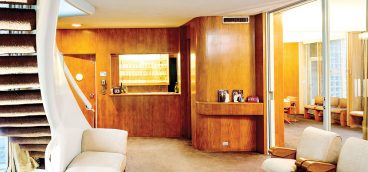
In the entry hall, a new stairway occupies the site where the original staircase was removed in the 1970s. Metal mesh panels, salvaged from the old book stacks, create a pleasant screen that takes on a modernist aesthetic as a backing for the crisp new information desk.
Sometimes the revealed structure is a spectacle of its own. At the entrance to Makeshop, the three-foot-thick walls are particularly pronounced. A steel beam is exposed, with the name Carnegie prominently featured not as donor, but as the stamp of the steel manufacturer.
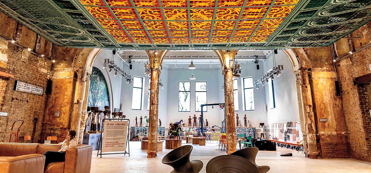
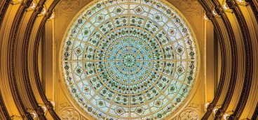
The Grable Gallery on the ground floor offers views of the underside of a newly inserted portion of the second floor. Here the laser-cut architectural artwork “Over View” hangs from the ceiling. A multi-layered rumination on the geometry of the lost piece of skylight glass that once covered the historic room, the geometry combines with profiles of the arches that line the upper portion of the wall. This is a sophisticated piece of abstract architectural art, worth a visit on its own.
So is a multi-story woven climber called “Gymlacium,” by artist Manca Ahlin, installed in a multi-level room where the book stacks once were. Another instance of museum-quality aesthetic contemplation, this one will also have bunches of kids climbing on it.
Such as is the nature of MuseumLab, blending play and seriousness, kids and adults, past and future. The building that looks like previous centuries is now also ready for the next one.


