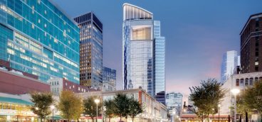
With the completion of the Tower at PNC Plaza, Pittsburgh has yet another generation of skyscraper design in its picturesque cityscape. Though our first tall steel-frame building—Longfellow, Alden & Harlow’s Carnegie Building of 1895—was lost in 1952 for the Kaufmann’s store annex, the Frick building of 1902 remains with several close contemporaries giving Pittsburgh more than a century of skyscrapers. They have gotten taller, and the all-important debates between austere and elaborate architectural treatments have cycled almost predictably over time. Still, within our close thicket of tall architecture, it is PPG Place that persists as a favorite since its opening in 1984. Called “Pittsburgh’s crown jewel” by critics at its completion, it’s earned that status in popular polls numerous times since. As with the building’s shimmering glass skin, though, there are some significant wrinkles in its story.
At the depths of the region’s industrial decline at the end of the 1970s, with the loss of jobs and residents by the tens of thousands, Mayor Richard Caligiuri led Renaissance II, an effort to reconstitute the ailing industrial city with a vital downtown full of office towers. PPG imagined a particularly ambitious Rockefeller Center-like rebuilding of a substantial downtown swath. They bought and cleared 5½ acres for the six buildings, the tallest at 40 stories, to provide more than 1 million square feet of office space around a central plaza. Such a brazen clear-cutting would not fit current standards of preservation or sustainability, but it suited the city’s frantic instinct for transformation at that time.
PPG Place also brought the excitement of architectural revolution. When the designs debuted in October 1980, it was an early foray into postmodern design in corporate office architecture. Three decades of post-World War II high-rise architecture as dour rectilinear slabs had shaped downtown Pittsburgh’s first Renaissance and much of the country as well. On the cusp of the 1980s, architects, bored with the aesthetic austerity, were turning to more entertaining shapes and colors, with renewed references to architectural history.
[Architect Philip] Johnson didn’t create what Pittsburgh was, he made what Pittsburgh wanted to be.
Architect Philip Johnson, at this time in partnership with architect John Burgee, was leading the movement. His AT&T Building, now Sony Building, in New York had an ornamented pink granite skin and a flamboyant Chippendale top that scandalized the world of architecture in 1979 and put him on the cover of Time magazine. Johnson became “a rock star of architecture,” architecture critic Paul Goldberger commented, not least because his postmodern turn was a rejection of the modern design that the architect had embraced for previous decades with equal fervor.
Who would be better for the historical moment of casting off the steel industry for a new image than the architect who had abandoned modernism to remake himself as a postmodernist? Johnson was far from the only architect in this style. In Pittsburgh alone, among buildings rising in the same years and shortly after, Allegheny International (now EQT) had its multicolored stone, and Dravo (now BNY Mellon Center) had its Art Deco revival sculpted crown. Fifth Avenue Place had its curiously clasp-like top.
But PPG’s crown of spires, up to 82 feet above the functioning portion of the building, outshone them all in exuberant expression and memorable appearance. Whether Johnson was a leader or more accurately, as critics alleged, a weathervane, PPG was “a tough act to follow,” admitted Hugh Stubbins, architect of Fifth Avenue Place. “No building created as much comment as PPG Place…” observed critic Donald Miller.
Johnson didn’t create what Pittsburgh was, he made what Pittsburgh wanted to be. Indeed, the oft-repeated claim that PPG takes inspiration from the Cathedral of Learning is harmless architectural baloney. Johnson and Burgee’s Transco Tower in Houston, which precedes PPG, looks more like Pitt’s skyscraper because Johnson had already been interested in Art Deco skyscrapers of the 1920s and 30s–stylistic cousins of the Cathedral. PPG’s high-rise, meanwhile, is more akin to the Victoria Tower in London’s Houses of Parliament, not really a reference to the Pittsburgh architectural context at all. In a candid comment to Progressive Architecture magazine, Johnson admitted that the PPG design “started with the development of the wall,” not any local inspiration. “I don’t think we sat down to look at Gothic.” But the lack of local reference hardly matters when the appealing skyline drama is so successful.
The real difficulty is that, while the architect understood spectacle, he never quite comprehended place—how to make an appealing streetscape for pedestrians—regardless of the building’s name. For all the popularity of the top, it was “a glass knife” at ground level, commented architect David Lewis in 1984. Architecture magazine agreed. It had the “least successful experiences for people on the street…” of any of Pittsburgh’s new architecture of the era.
Adjacent Market Square has transformed in recent years from a rough and seedy difficulty to a showcase public space through delicate landscape redesign, traffic re-engineering, generous implementation of public artwork and (at least some) preservation of historic architecture.
PPG’s Plaza, meanwhile, still struggles. The best upgrades have been the ones that are suitable to the more appealing aspects of its character. Originally implemented in 2001 and recently enlarged, the seasonal skating rink is perfect for the permanent ice palace. Likewise, glistening summertime fountains humanize the best in Pittsburgh’s most shimmery building.
But recent changes by the property’s new owners to make tenant signage more visible and give restaurants new prominence at the street level are unsympathetic and ill-advised. Good designers need to create street-level improvements that bring people in without ruining the appealing parts of the building’s architectural character. That may be an even more challenging architectural feat than Johnson and Burgee accomplished in the 1980s, but our tribute to a favorite building complex should be to fix its flaws, not compromise its strengths. It has plenty of both.


