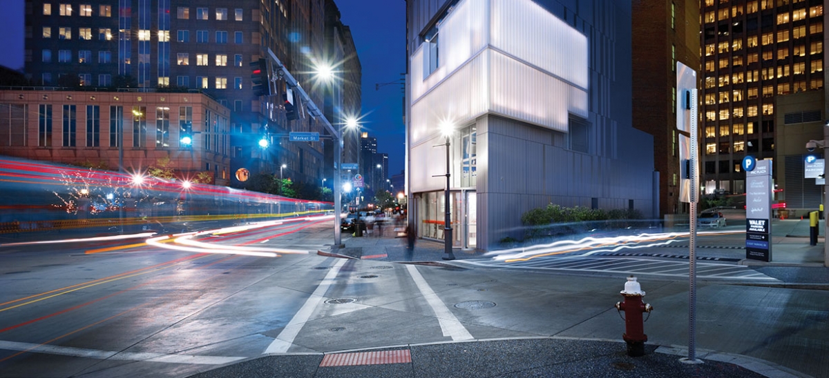
The widely repeated story goes something like this: Gary Saulson, PNC’s senior vice president for real estate, would regularly have lunch at a certain restaurant, from which he would have a direct view toward the Liberty Travel Building, a billboard-slathered misshapen lump, whose prominent location at the corner of Liberty and Sixth meant that its comparatively small, four-story profile was somehow disproportionately conspicuous.
Couldn’t something be done to mitigate this particular eyesore? Saulson determined that it could.
In recent years, PNC has focused on making quality architecture part of its corporate mission and image. One showcase tower, Three PNC Plaza, home of the Fairmont Hotel, is complete, with a parklet right nearby. Another major skyscraper, the tower at PNC Plaza, is coming out of the ground, with anticipated records to be set in sustainable building performance that reflect company-wide values.
Within this already-ambitious context, PNC has completed a comprehensive building renovation that is not simply good, but maybe too good—not just for what it is, but for what it suggests is possible.
It begins with the assumption that to fix an unfortunate urban vignette, you may need a healthy infusion of good contemporary architecture. For the Liberty Travel building, now renovated and known as the Lantern Building, PNC chose Edge Studios, which has a strong portfolio of ambitious contemporary design in projects such as the East Liberty Carnegie Library or the Mascaro Center for Sustainable Innovation at the University of Pittsburgh, to name just two. To the delight of principal Gary Carlough, PNC did not want to plaster its corporate logo on the building as some have done elsewhere. Instead, an architecturally ambitious re-skinning of the building would turn it from eyesore into urban sculpture.
In doing so, the building embraces the broader culture of contemporary architecture. It easily brings to mind Brad Cloepfil’s remodeling of Edward Durell Stone’s Huntington Hartford building at Columbus Circle in Manhattan, by which it became the Museum of Arts and Design. That was controversial, because the original structure was arguably a landmark, but there was no such distinguished predecessor for the Liberty Avenue project. The translucent channel glass is the same material used in Steven Holl’s Nelson Atkins Museum Addition in Kansas City to an arguably even more dynamic effect. Make no mistake, Edge has transformed this building into something very much its own. Yet, the sense that it takes part in an international conversation is affirming indeed.
In this new context, the adjacent Three PNC Plaza on Market and Fifth is certainly not bad, and it may be an apples to oranges comparison. Now, though, those who have long suggested that it is bland and unresolved have a substantial comparison to support their assertion. The forthcoming Tower at PNC Plaza, characterized thus far in terms of its sustainability, can be subject to discussion of aesthetic architectural design as well.
A similar set of issues emerges in the discussion of the Lantern Building’s use. Again, the news is very good. PNC has elected to use the building chiefly as a display for the PNC Legacy Project. This corporation-wide effort primarily collects the artifacts of the banks that PNC acquires. They already have similar displays in Washington, D.C., Baltimore, Cleveland and central Pennsylvania. For the Lantern Building implementation, the current installations emphasize the contributions of PNC to the broader Pittsburgh community by listing on the wall names of organizations that PNC supports. More dramatically, long and narrow hand-held speakers hang from the ceiling, echoing the shape of multicolored lights higher up. The speakers play back recorded oral histories from distinguished Pittsburghers whose portraits are displayed on the wall.
What you could also do, I suggested to two of PNC’s public relations professionals, is take written or recorded histories from people who visit the space, which is open to the public. Whether for the Teenie Harris or “Oh Snap” exhibits, the Carnegie Museum of Art has been using crowdsourcing in a way that the increasingly museum-like functions of the Legacy Project could follow. Written or recorded recollections from visitors could become part of the display.
My recorded recollection would be about 428 Wood Street, the exquisitely neoclassical former Bolan’s Candy building. Recognized as one of downtown’s foremost preservation-worthy neoclassical buildings during the Fifth and Forbes redevelopment debates of around 1999, it nonetheless came down in preparation for construction of the Tower at PNC Plaza. According to Fred Solomon, corporate vice president for public relations, the building was carefully measured and its key components put into storage, but its final fate has not been announced.
A more consistent and open process of historic review should have determined the building’s fate. It should have remained standing. A distant second would have been for PNC to be clear about its intentions for it from the outset. Although recent headlines announce PNC’s use of the old Mellon Bank on Smithfield Street, with a priority to display old architectural artifacts that were in storage, they have announced no specific plans for any artifacts of 428 Wood.
Actually, an exhibition on the former Bolan’s Candy building and other lost buildings would be a great subject for an exhibit in the Lantern Building.
For PNC to use contemporary architecture and community history as part of its culture can clearly lead to outstanding results. But it also leads to expectations about taking design cues from further afield and gathering more community input from closer to home.


